Tarboro Brewing Company

Revitalizing a town

Capabilities
Brand Identity
Graphic Design
Market Trend Analysis
Market Research
Web Development

The process began with the purchase of a building that is now the home of Tarboro Brewing Company. Inez and Stephen didn't just want to start a brewery--they wanted to revitalize a town. Inez and Stephen brewed up four great beer recipes that needed a name and a face that could bring the whole community of Tarboro, NC together. TBC challenged us to come up with a brand that felt like “coming home.” This became the mantra that guided our entire design process.

Challenge

Crafted to bring you home, again and again

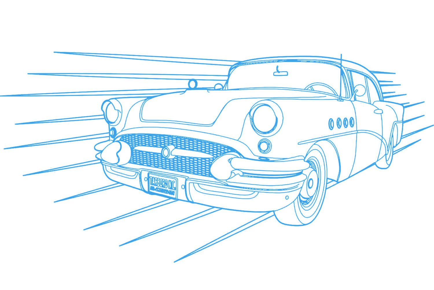
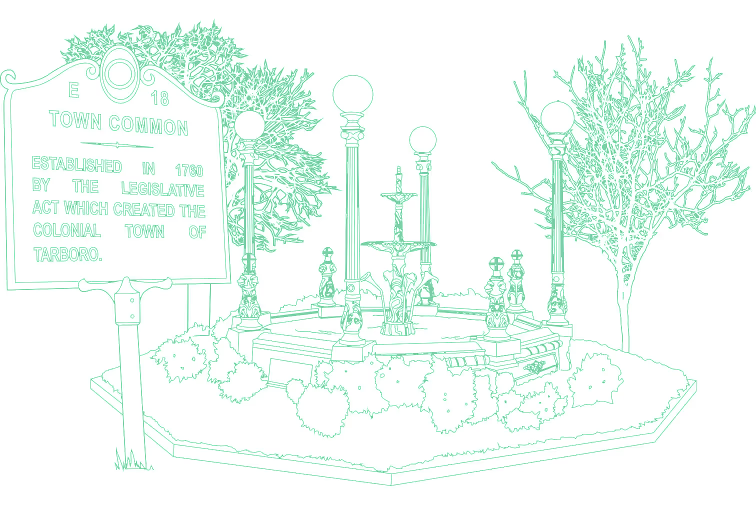
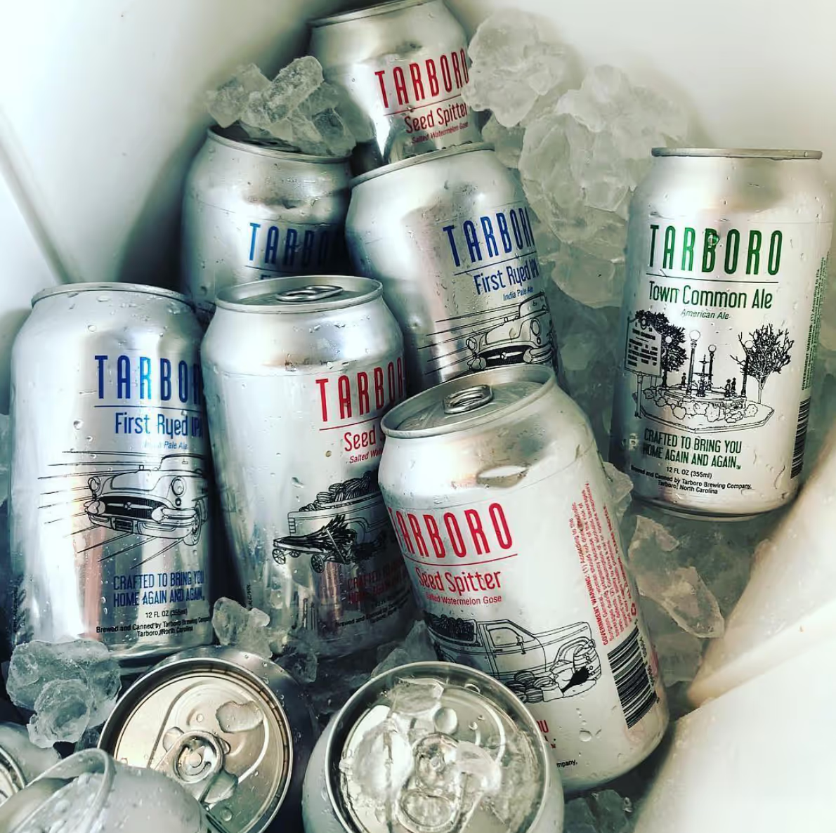
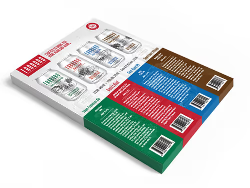
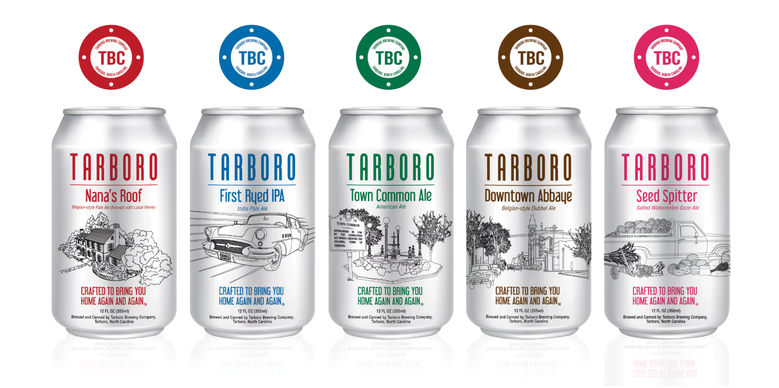
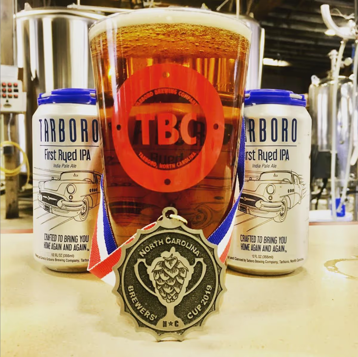
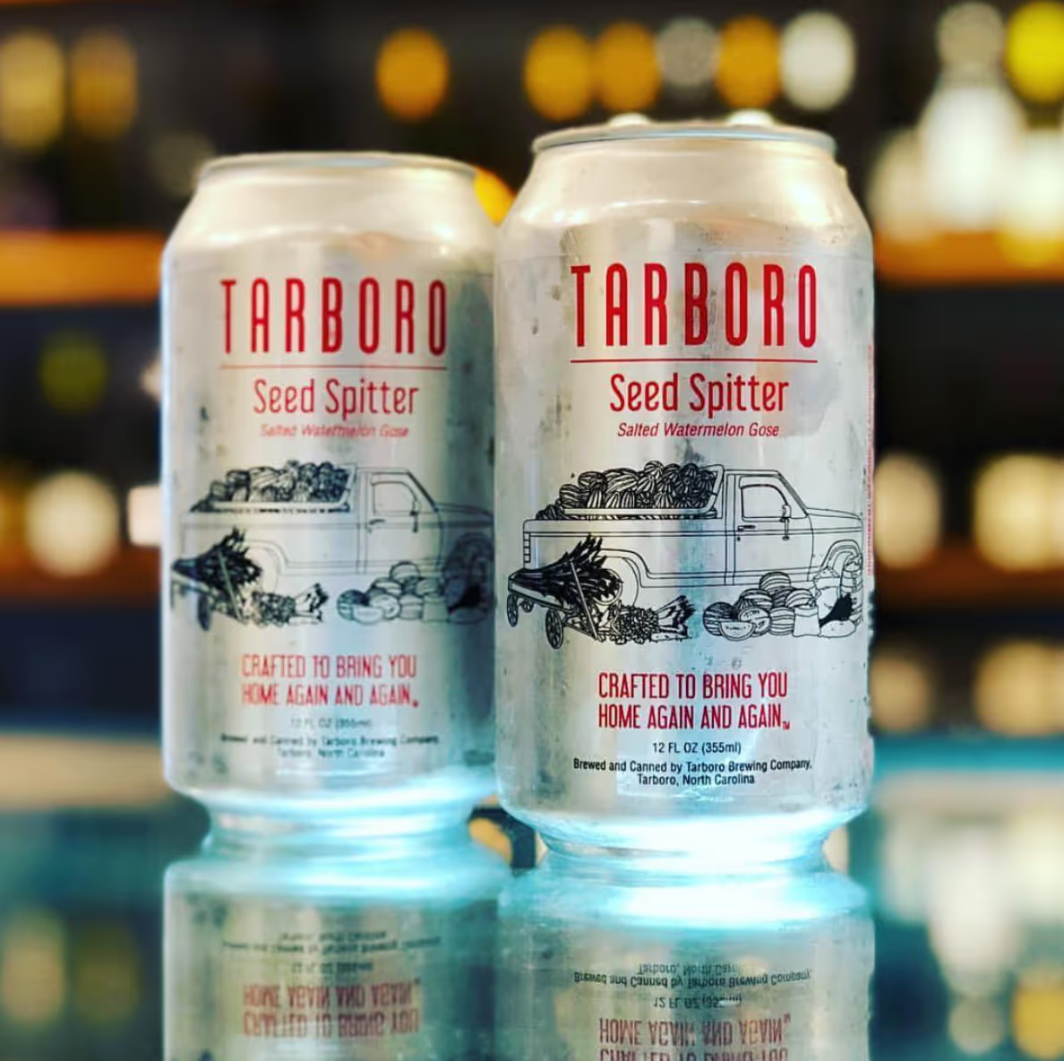
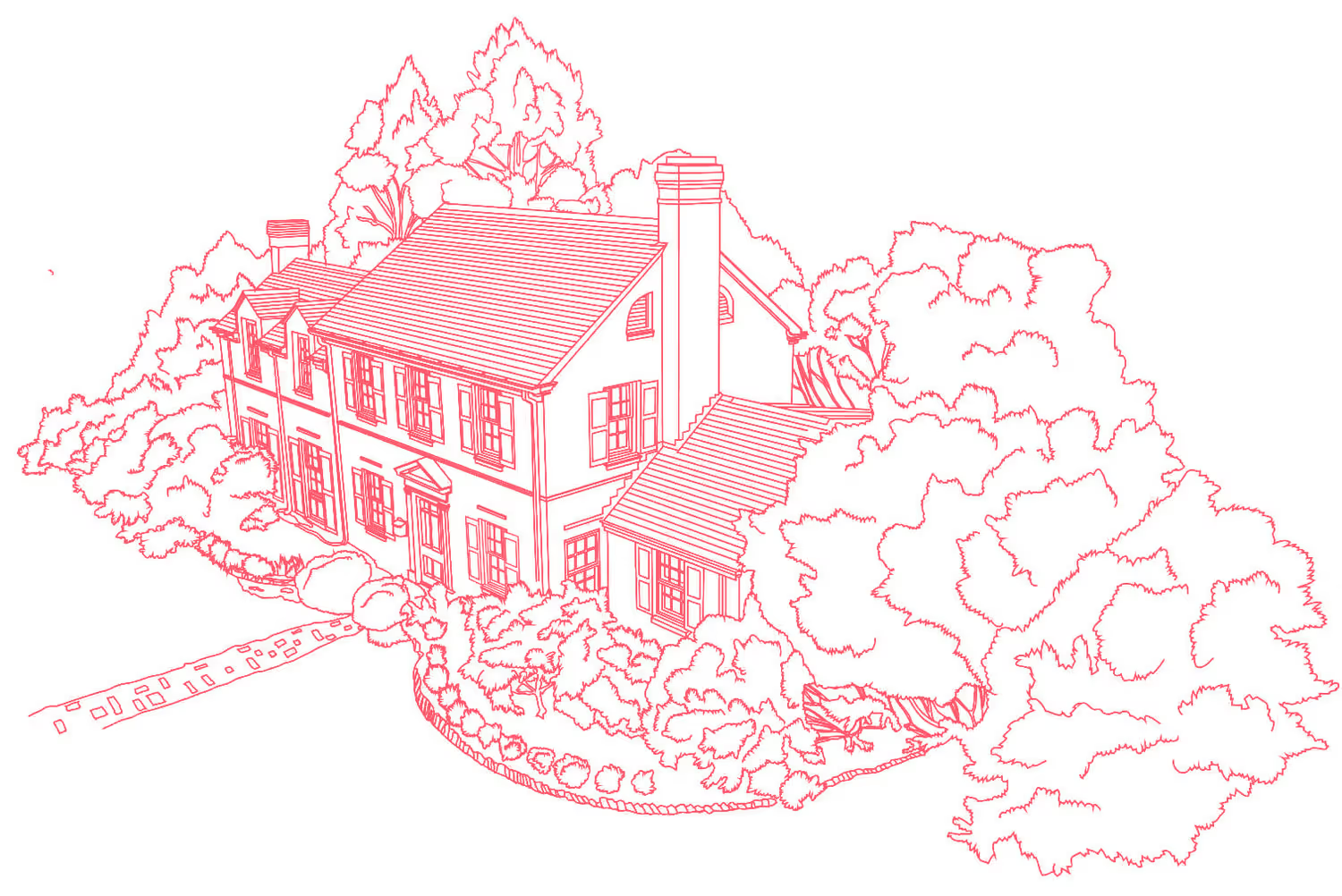
Nana’s Roof, First Ryed IPA, Town Common Ale, and Downtown Abbaye. These are the four uniquely tasty brews that TBC was ready to put out into the market. The design of these four custom beer labels set the stage for the rest of the deliverables. We drew inspiration from the Tarboro name, the town that's near and dear to the hearts of Stephen and Inez.

Approach

Simple and refined

After working up several design options that spoke to the "Innocent" archetype, who embodies hope and renewal, we ended up with a can that is clean and simple, in a refined, Southern way.

(Read more about “innocent” and other brand archetypes in our write-up here.)

Explore

No items found.
No items found.

Prototype

No items found.
No items found.

Build

No items found.
No items found.
If I were to describe Trig, it would be friendly, professional, efficient, creative, and invested. I found the competitive brand analysis to be the most impressive aspect of the brand development process and had never seen anything like it before. It started with a conversation and not just throwing out cool ideas. They really got to know me and did their due diligence to get to the solution. Trig is passionate about what they do. They make clients feel comfortable and feel qualified to be a part of the design process. There’s nothing Trig could have done differently—I’ve been so pleased.
Inez Ribustello
Founder
Result

We are recognized as a top beer logo design company on DesignRush!

Additional Quotes

Additional Case Studies

Tarboro Brewing Company

Revitalizing a town

Capabilities
Brand Identity
Graphic Design
Market Trend Analysis
Market Research
Web Development

The process began with the purchase of a building that is now the home of Tarboro Brewing Company. Inez and Stephen didn't just want to start a brewery--they wanted to revitalize a town. Inez and Stephen brewed up four great beer recipes that needed a name and a face that could bring the whole community of Tarboro, NC together. TBC challenged us to come up with a brand that felt like “coming home.” This became the mantra that guided our entire design process.

Challenge

Crafted to bring you home, again and again

Nana’s Roof, First Ryed IPA, Town Common Ale, and Downtown Abbaye. These are the four uniquely tasty brews that TBC was ready to put out into the market. The design of these four custom beer labels set the stage for the rest of the deliverables. We drew inspiration from the Tarboro name, the town that's near and dear to the hearts of Stephen and Inez.

Process

Simple and refined

After working up several design options that spoke to the "Innocent" archetype, who embodies hope and renewal, we ended up with a can that is clean and simple, in a refined, Southern way.

(Read more about “innocent” and other brand archetypes in our write-up here.)

No items found.
No items found.
Solution

Who we are

“We are people who love beer and want to make our wonderful town a popular place to visit and live. We believe in the power of beer as a tool for bonding and helping others. We enjoy making people happy, and we feel like our brewery is a place to enjoy the company of great people over a refreshing beverage (we offer non-alcoholic drinks for those who do not imbibe)."

Why we do it

“Long ago, we realized it takes a town to raise a pint. We found a loving, thriving community and set up shop in the perfect spot on Main Street. We wanted to give back as best we could, so we set up a space and began brewing beers everyone could enjoy. Fine malts, select hops, and the Tar River's finest come together in every single one of our beers. We hope you love them all, because they were crafted to bring you home again and again."

If I were to describe Trig, it would be friendly, professional, efficient, creative, and invested. I found the competitive brand analysis to be the most impressive aspect of the brand development process and had never seen anything like it before. It started with a conversation and not just throwing out cool ideas. They really got to know me and did their due diligence to get to the solution. Trig is passionate about what they do. They make clients feel comfortable and feel qualified to be a part of the design process. There’s nothing Trig could have done differently—I’ve been so pleased.
Inez Ribustello
Founder
Result

We are recognized as a top beer logo design company on DesignRush!
Tarboro Brewing Company

Revitalizing a town

Capabilities
Brand Identity
Graphic Design
Market Trend Analysis
Market Research
Web Development

The process began with the purchase of a building that is now the home of Tarboro Brewing Company. Inez and Stephen didn't just want to start a brewery--they wanted to revitalize a town. Inez and Stephen brewed up four great beer recipes that needed a name and a face that could bring the whole community of Tarboro, NC together. TBC challenged us to come up with a brand that felt like “coming home.” This became the mantra that guided our entire design process.

Challenge

Crafted to bring you home, again and again

Nana’s Roof, First Ryed IPA, Town Common Ale, and Downtown Abbaye. These are the four uniquely tasty brews that TBC was ready to put out into the market. The design of these four custom beer labels set the stage for the rest of the deliverables. We drew inspiration from the Tarboro name, the town that's near and dear to the hearts of Stephen and Inez.

Process

Simple and refined

After working up several design options that spoke to the "Innocent" archetype, who embodies hope and renewal, we ended up with a can that is clean and simple, in a refined, Southern way.

(Read more about “innocent” and other brand archetypes in our write-up here.)

No items found.
Solution

Who we are

“We are people who love beer and want to make our wonderful town a popular place to visit and live. We believe in the power of beer as a tool for bonding and helping others. We enjoy making people happy, and we feel like our brewery is a place to enjoy the company of great people over a refreshing beverage (we offer non-alcoholic drinks for those who do not imbibe)."

Why we do it

“Long ago, we realized it takes a town to raise a pint. We found a loving, thriving community and set up shop in the perfect spot on Main Street. We wanted to give back as best we could, so we set up a space and began brewing beers everyone could enjoy. Fine malts, select hops, and the Tar River's finest come together in every single one of our beers. We hope you love them all, because they were crafted to bring you home again and again."

No items found.
If I were to describe Trig, it would be friendly, professional, efficient, creative, and invested. I found the competitive brand analysis to be the most impressive aspect of the brand development process and had never seen anything like it before. It started with a conversation and not just throwing out cool ideas. They really got to know me and did their due diligence to get to the solution. Trig is passionate about what they do. They make clients feel comfortable and feel qualified to be a part of the design process. There’s nothing Trig could have done differently—I’ve been so pleased.
Inez Ribustello
Founder
Result

We are recognized as a top beer logo design company on DesignRush!