Dr. Elizabeth Miller is a pediatric dentist based in North Carolina, serving the Rocky Mount, Tarboro, Wilson, Nashville, Spring Hope, Greenville and Roanoke Rapids areas. Beyond her training in general dentistry, Dr. Miller also has 3 years of training in child psychology, pediatric nutrition, growth and development in children, pediatric medicine, and developmental orthodontics. Dr. Miller entrusted Trig with creating fun-filled brand experience for children of all ages at Miller’s pediatric dentistry.

Dr. Miller approached Trig for a brand refresh for her pediatric dental practice that would capture her vision for a fun-filled learning environment designed for children of all ages. She and her team are specially trained to work with young children and children with special needs and handle every interaction with each child with the utmost empathy and care. They believe this empathy creates a safe environment and encourages children to develop healthy dental hygiene habits that will last a lifetime. It was important that we crafted a brand that mirrored the Miller team and was friendly, approachable, promoted a sense of safety and security, and inspired boundless confidence.
The previous branding was inherited from a former partner and didn’t capture the Miller team’s ethos or their desire to create an inviting environment with a strong sense of playfulness and delightful discovery. We embarked on a journey to create a new brand that would encourage children to explore, learn, discover, and have fun.
We started the brand building process by performing a competitive brand analysis. This analysis provided us the context we needed to position Dr. Miller’s brand and secure a competitive edge. After scouting out dozens of local pediatric dental practices and mapping out their levels of brand sophistication, 4 brands stood out and rose to the top. We dove deep into each of these 4 brands and mapped out the functional, visual, and tonal trends among them as well as each of their archetypes.
In addition to reverse-engineering the brand strategies of direct competitors, we also looked at larger indirect competitors, such as the Smile Direct Club, for gaps in industry trends of which our new brand could fill. We also drew inspiration from out of category spaces, finding children museum brands to be aspirationally similar in terms of their general spirit of being crafted around discovery, playfulness, and curiosity that we hoped to achieve with Dr. Miller’s brand.
To capture a fuller picture, we also mapped out archetypes for the remaining competitor brands to gain insight into prevalent tonal and visual strategies. From here, we created a list of viable archetypes that would offer Dr. Miller’s brand a competitive edge and arrived at a Primary Jester with a secondary Innocent archetype set. The Jester, representing a playfulness in everything that it does, perfectly captures the ethos of Dr. Miller’s practice. By adding the secondary dimension of an Innocent as a tilt, we are able to also encapsulate a warm feeling of “striving for the ideal”—always looking to improve every patient experience and making sure to approach each patient with a sense of care and kindness. These archetypes would serve as the visual and tonal north star for the brand and would come to influence each piece of brand asset developed to ensure brand language consistency, building brand equity and strengthening brand loyalty.


Dr. Miller’s brand now emphasizes care and kindness with a healthy balance of fun, discovery, and confidence. While before Dr. Miller’s practice had a brand that was inherited from a former partner that didn’t speak to the core values of herself or her team, she now has a brand that not only encapsulates these core values, but also expresses them for all current and prospective customers to see. While the new brand captures Dr. Miller’s visual preferences, its archetype set also positions her practice for success in the context of her competitors. We feel so privileged to have worked on developing this new brand with her!
Dr. Elizabeth Miller is a pediatric dentist based in North Carolina, serving the Rocky Mount, Tarboro, Wilson, Nashville, Spring Hope, Greenville and Roanoke Rapids areas. Beyond her training in general dentistry, Dr. Miller also has 3 years of training in child psychology, pediatric nutrition, growth and development in children, pediatric medicine, and developmental orthodontics. Her practice has earned over 1200 5-star reviews.
Dr. Elizabeth Miller is a pediatric dentist based in North Carolina, serving the Rocky Mount, Tarboro, Wilson, Nashville, Spring Hope, Greenville and Roanoke Rapids areas. Beyond her training in general dentistry, Dr. Miller also has 3 years of training in child psychology, pediatric nutrition, growth and development in children, pediatric medicine, and developmental orthodontics. Dr. Miller entrusted Trig with creating fun-filled brand experience for children of all ages at Miller’s pediatric dentistry.
Dr. Miller approached Trig for a brand refresh for her pediatric dental practice that would capture her vision for a fun-filled learning environment designed for children of all ages. She and her team are specially trained to work with young children and children with special needs and handle every interaction with each child with the utmost empathy and care. They believe this empathy creates a safe environment and encourages children to develop healthy dental hygiene habits that will last a lifetime. It was important that we crafted a brand that mirrored the Miller team and was friendly, approachable, promoted a sense of safety and security, and inspired boundless confidence.
The previous branding was inherited from a former partner and didn’t capture the Miller team’s ethos or their desire to create an inviting environment with a strong sense of playfulness and delightful discovery. We embarked on a journey to create a new brand that would encourage children to explore, learn, discover, and have fun.
We started the brand building process by performing a competitive brand analysis. This analysis provided us the context we needed to position Dr. Miller’s brand and secure a competitive edge. After scouting out dozens of local pediatric dental practices and mapping out their levels of brand sophistication, 4 brands stood out and rose to the top. We dove deep into each of these 4 brands and mapped out the functional, visual, and tonal trends among them as well as each of their archetypes.
In addition to reverse-engineering the brand strategies of direct competitors, we also looked at larger indirect competitors, such as the Smile Direct Club, for gaps in industry trends of which our new brand could fill. We also drew inspiration from out of category spaces, finding children museum brands to be aspirationally similar in terms of their general spirit of being crafted around discovery, playfulness, and curiosity that we hoped to achieve with Dr. Miller’s brand.
To capture a fuller picture, we also mapped out archetypes for the remaining competitor brands to gain insight into prevalent tonal and visual strategies. From here, we created a list of viable archetypes that would offer Dr. Miller’s brand a competitive edge and arrived at a Primary Jester with a secondary Innocent archetype set. The Jester, representing a playfulness in everything that it does, perfectly captures the ethos of Dr. Miller’s practice. By adding the secondary dimension of an Innocent as a tilt, we are able to also encapsulate a warm feeling of “striving for the ideal”—always looking to improve every patient experience and making sure to approach each patient with a sense of care and kindness. These archetypes would serve as the visual and tonal north star for the brand and would come to influence each piece of brand asset developed to ensure brand language consistency, building brand equity and strengthening brand loyalty.
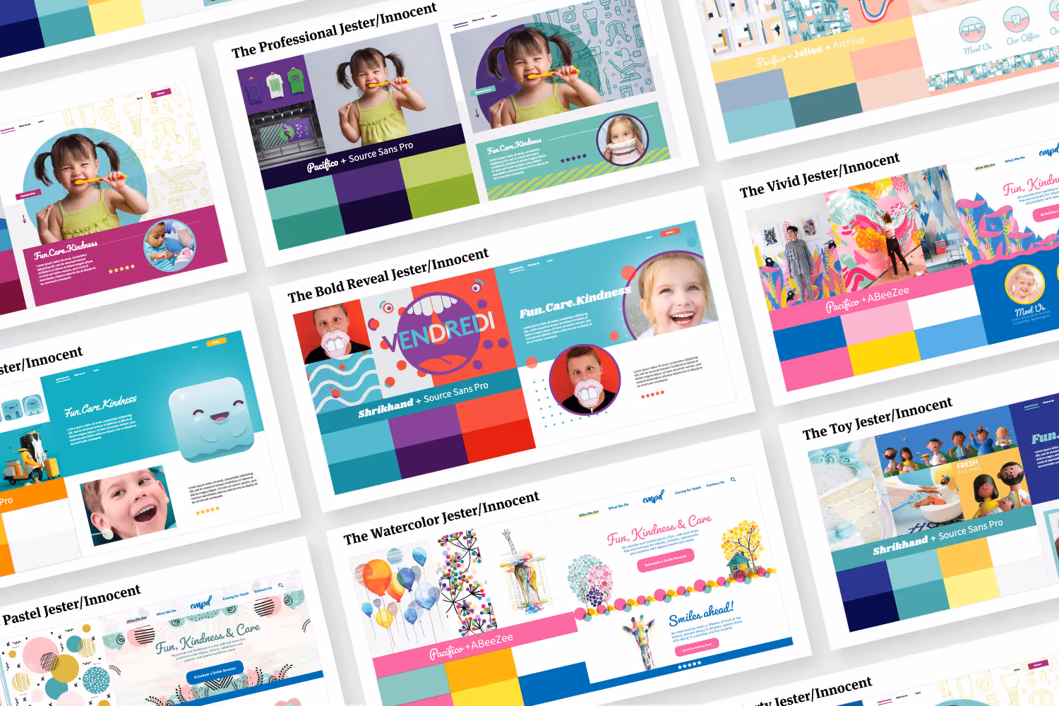
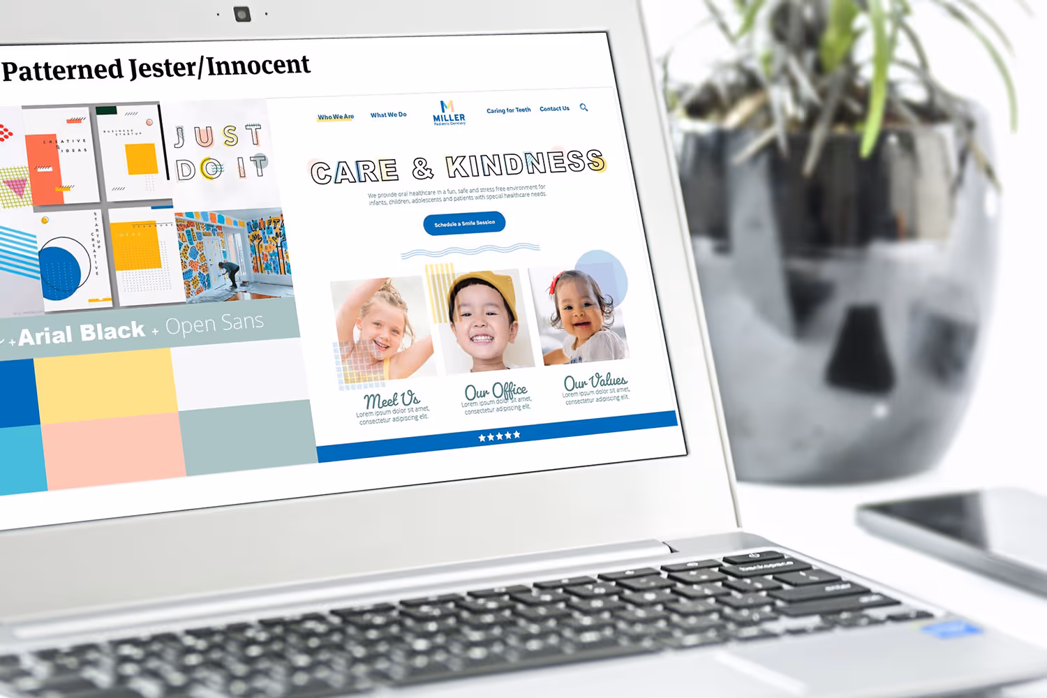
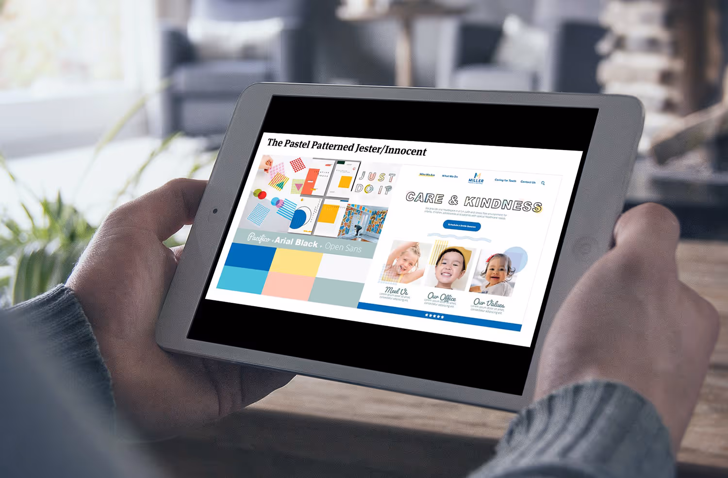
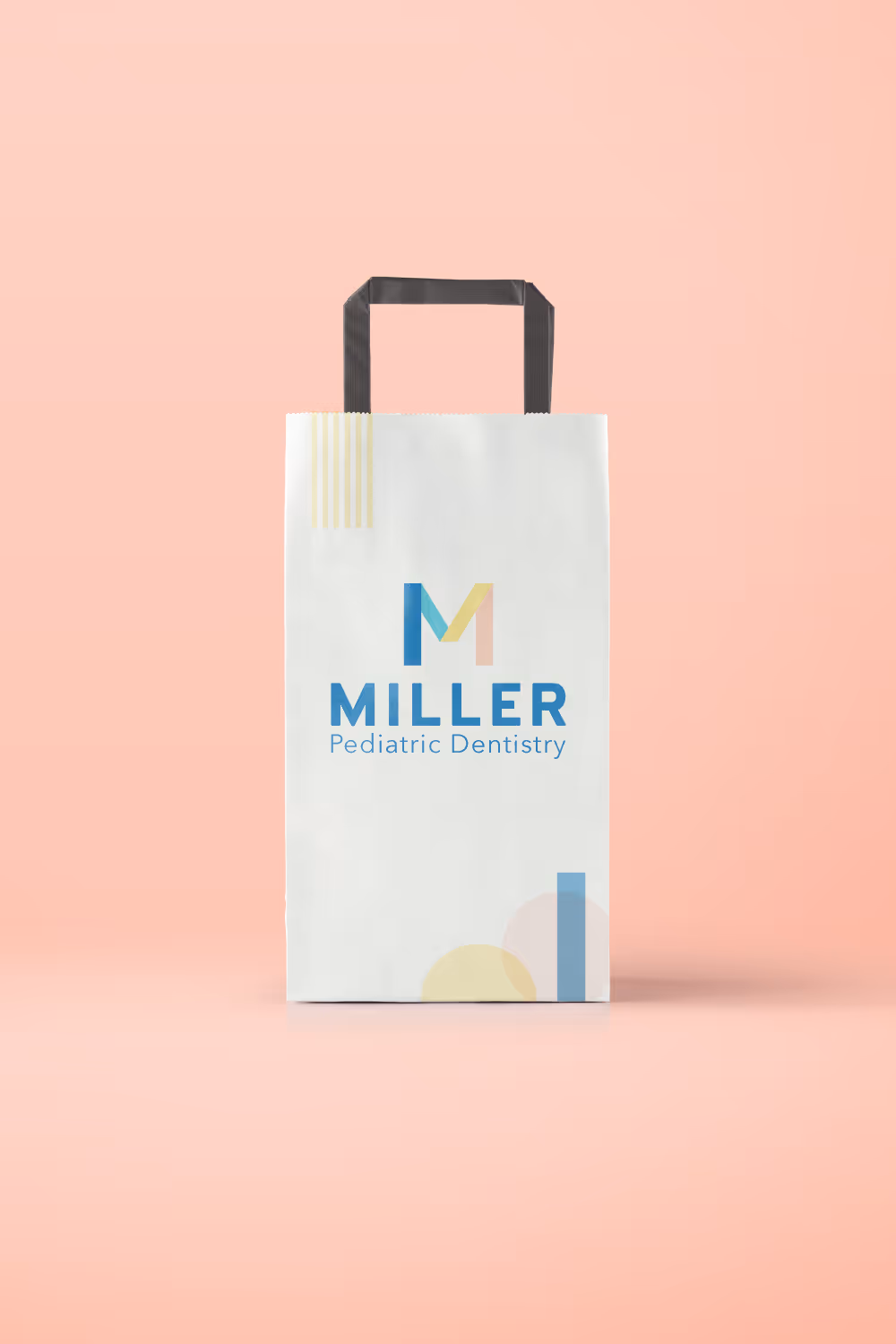
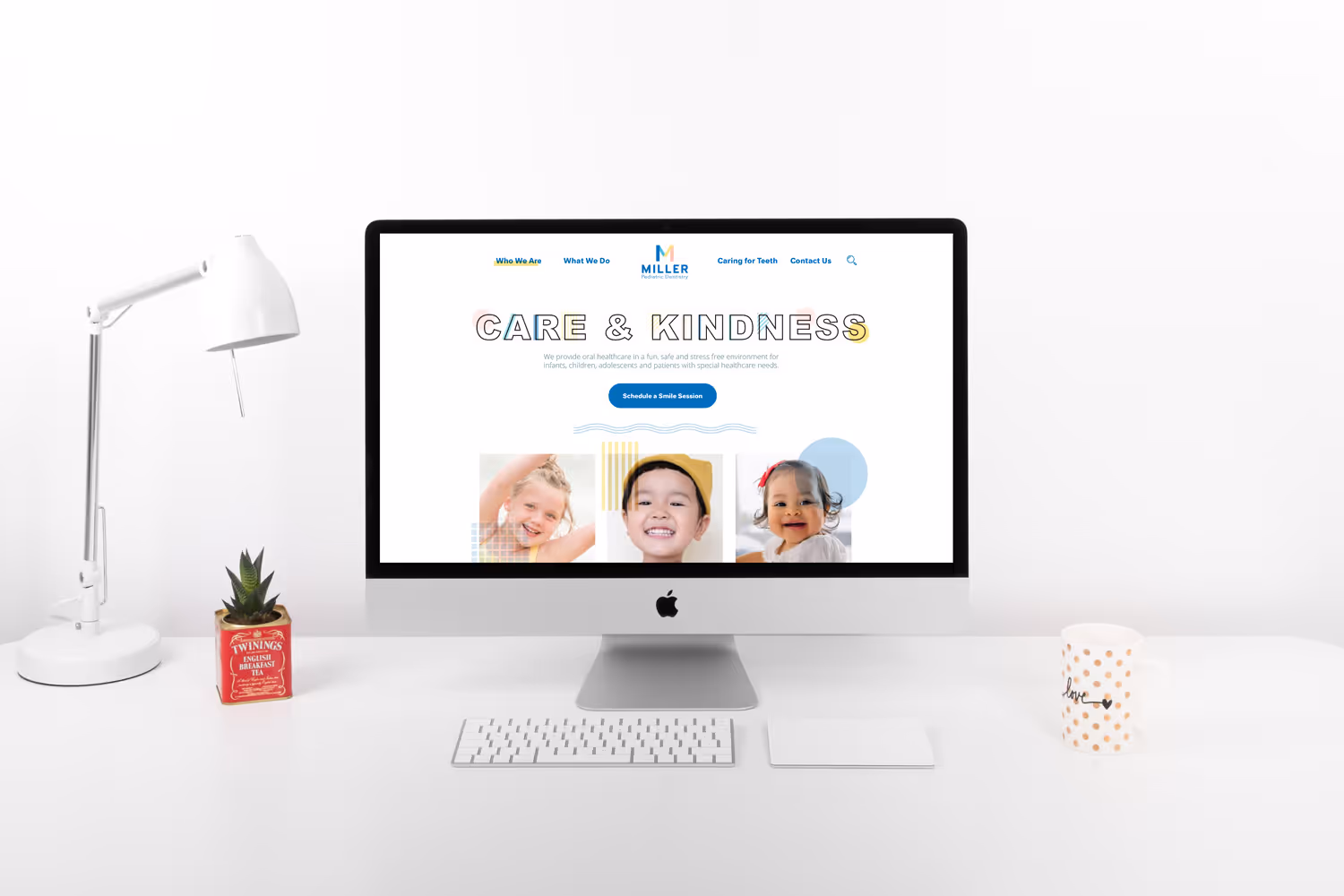
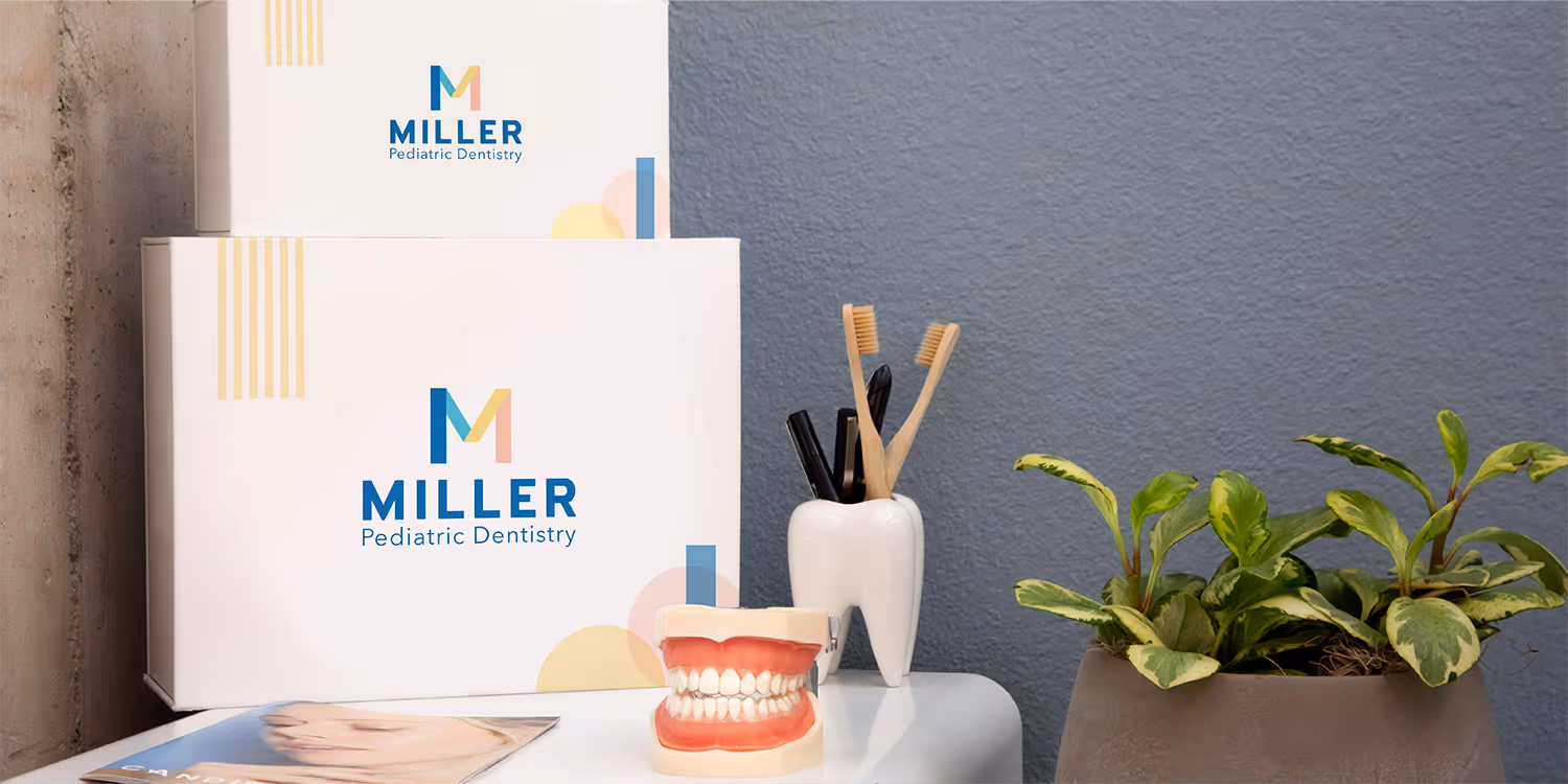
After the primary and secondary archetypes were finalized, we worked with Dr. Miller to hone in on her unique expressions of them. We asked her to answer a series of questions around her core values, worked with her to refine those answers, and then offered a plethora of different style board options that reflected both her core values and the selected archetype set. Visually, Dr. Miller was also interested in incorporating a strong duke blue color into her otherwise nostalgia-influenced aesthetic. The style boards were designed on a spectrum ranging from Jester to Innocent, from the most colorful and playful options to the lightest and most modest options. Dr. Miller opted for one of the style boards closer to the Innocent palette, with the tone of the brand very much within the Jester space. The winning style board is soft and calming, coupled with bright pastel colors, and a confident duke blue to complete the visual composition of the brand.
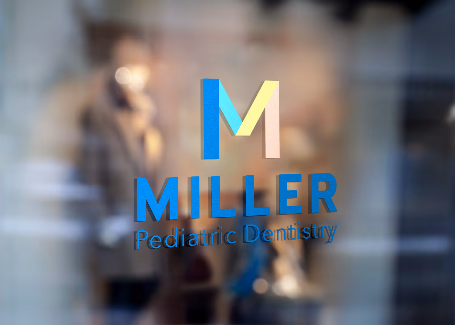
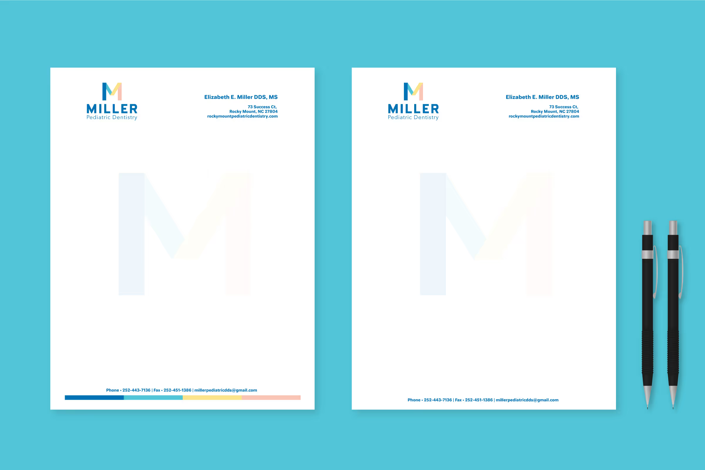
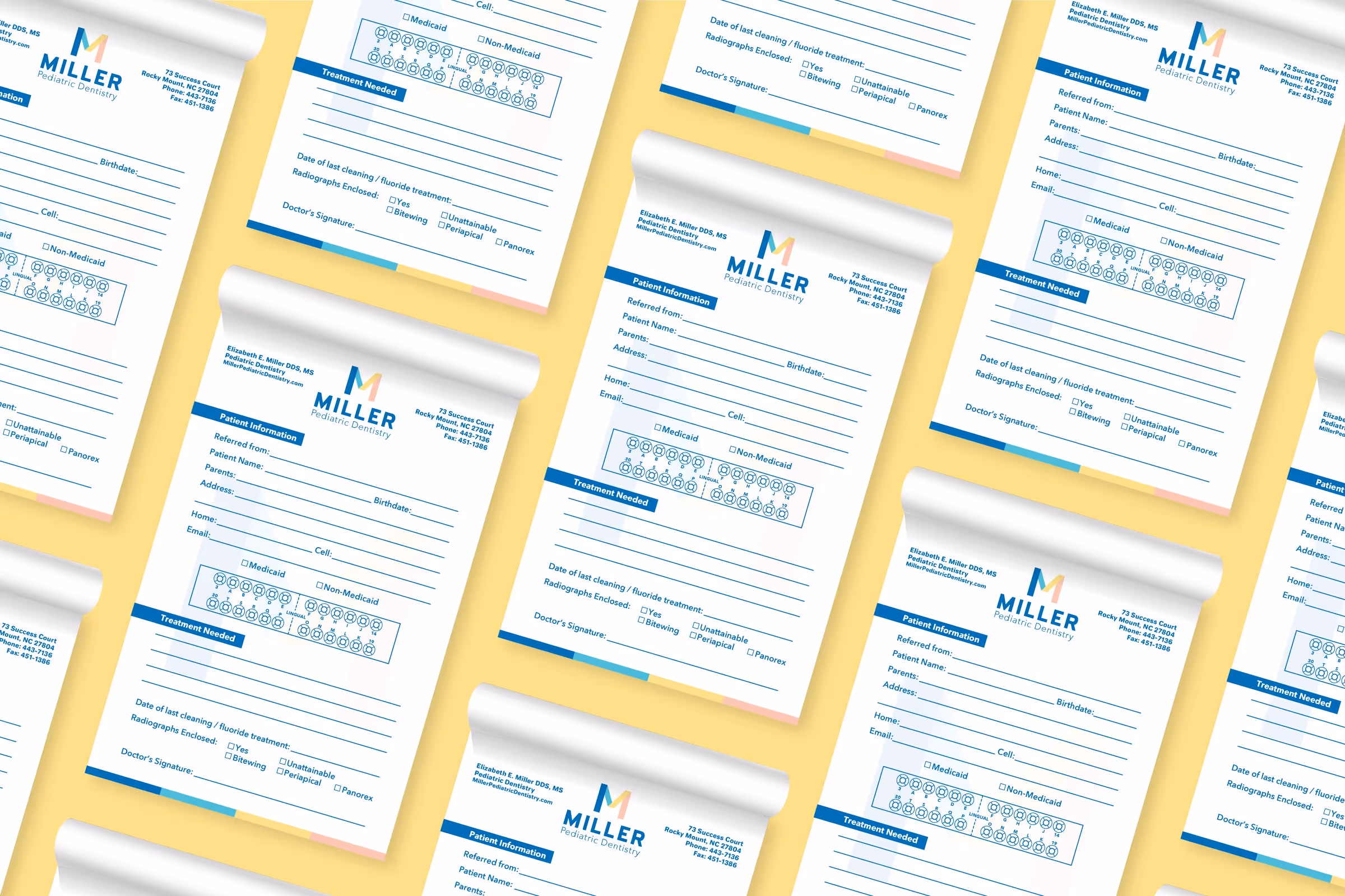
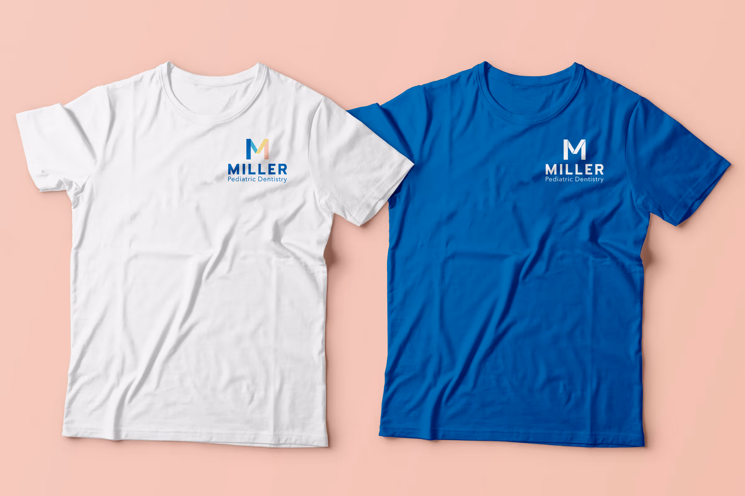
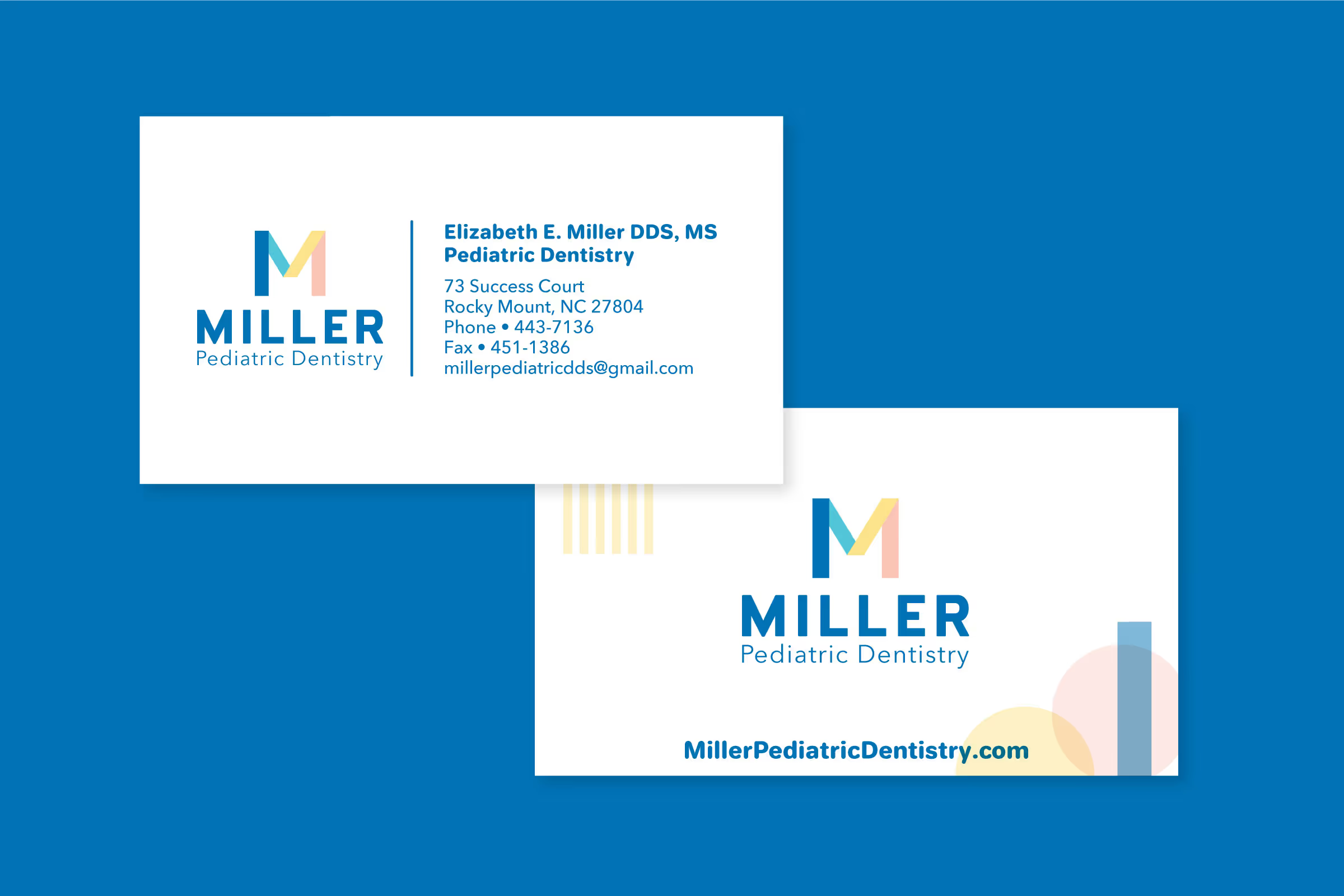
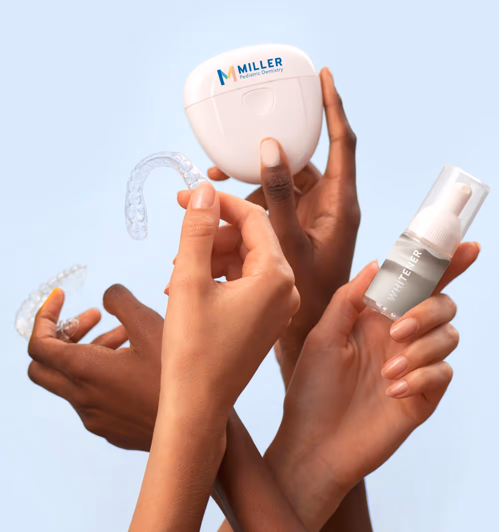
We then used the selected styleboard as a short-hand guide for developing Dr. Miller’s brand assets. We went on to develop and finalize logos, created branded letterheads, referral pads, and business cards, prepared logo sets for printing on apparel, redesigned the wooden sign in front of her practice, and also developed social media graphic sets that reflected her new branding. All with a consistent visual brand language and tone that authentically reflected her practice, core values, and personal aesthetic preferences.

Dr. Miller’s brand now emphasizes care and kindness with a healthy balance of fun, discovery, and confidence. While before Dr. Miller’s practice had a brand that was inherited from a former partner that didn’t speak to the core values of herself or her team, she now has a brand that not only encapsulates these core values, but also expresses them for all current and prospective customers to see. While the new brand captures Dr. Miller’s visual preferences, its archetype set also positions her practice for success in the context of her competitors. We feel so privileged to have worked on developing this new brand with her!
Dr. Elizabeth Miller is a pediatric dentist based in North Carolina, serving the Rocky Mount, Tarboro, Wilson, Nashville, Spring Hope, Greenville and Roanoke Rapids areas. Beyond her training in general dentistry, Dr. Miller also has 3 years of training in child psychology, pediatric nutrition, growth and development in children, pediatric medicine, and developmental orthodontics. Her practice has earned over 1200 5-star reviews.
Dr. Elizabeth Miller is a pediatric dentist based in North Carolina, serving the Rocky Mount, Tarboro, Wilson, Nashville, Spring Hope, Greenville and Roanoke Rapids areas. Beyond her training in general dentistry, Dr. Miller also has 3 years of training in child psychology, pediatric nutrition, growth and development in children, pediatric medicine, and developmental orthodontics. Dr. Miller entrusted Trig with creating fun-filled brand experience for children of all ages at Miller’s pediatric dentistry.
Dr. Miller approached Trig for a brand refresh for her pediatric dental practice that would capture her vision for a fun-filled learning environment designed for children of all ages. She and her team are specially trained to work with young children and children with special needs and handle every interaction with each child with the utmost empathy and care. They believe this empathy creates a safe environment and encourages children to develop healthy dental hygiene habits that will last a lifetime. It was important that we crafted a brand that mirrored the Miller team and was friendly, approachable, promoted a sense of safety and security, and inspired boundless confidence.
The previous branding was inherited from a former partner and didn’t capture the Miller team’s ethos or their desire to create an inviting environment with a strong sense of playfulness and delightful discovery. We embarked on a journey to create a new brand that would encourage children to explore, learn, discover, and have fun.
We started the brand building process by performing a competitive brand analysis. This analysis provided us the context we needed to position Dr. Miller’s brand and secure a competitive edge. After scouting out dozens of local pediatric dental practices and mapping out their levels of brand sophistication, 4 brands stood out and rose to the top. We dove deep into each of these 4 brands and mapped out the functional, visual, and tonal trends among them as well as each of their archetypes.
In addition to reverse-engineering the brand strategies of direct competitors, we also looked at larger indirect competitors, such as the Smile Direct Club, for gaps in industry trends of which our new brand could fill. We also drew inspiration from out of category spaces, finding children museum brands to be aspirationally similar in terms of their general spirit of being crafted around discovery, playfulness, and curiosity that we hoped to achieve with Dr. Miller’s brand.
To capture a fuller picture, we also mapped out archetypes for the remaining competitor brands to gain insight into prevalent tonal and visual strategies. From here, we created a list of viable archetypes that would offer Dr. Miller’s brand a competitive edge and arrived at a Primary Jester with a secondary Innocent archetype set. The Jester, representing a playfulness in everything that it does, perfectly captures the ethos of Dr. Miller’s practice. By adding the secondary dimension of an Innocent as a tilt, we are able to also encapsulate a warm feeling of “striving for the ideal”—always looking to improve every patient experience and making sure to approach each patient with a sense of care and kindness. These archetypes would serve as the visual and tonal north star for the brand and would come to influence each piece of brand asset developed to ensure brand language consistency, building brand equity and strengthening brand loyalty.
After the primary and secondary archetypes were finalized, we worked with Dr. Miller to hone in on her unique expressions of them. We asked her to answer a series of questions around her core values, worked with her to refine those answers, and then offered a plethora of different style board options that reflected both her core values and the selected archetype set. Visually, Dr. Miller was also interested in incorporating a strong duke blue color into her otherwise nostalgia-influenced aesthetic. The style boards were designed on a spectrum ranging from Jester to Innocent, from the most colorful and playful options to the lightest and most modest options. Dr. Miller opted for one of the style boards closer to the Innocent palette, with the tone of the brand very much within the Jester space. The winning style board is soft and calming, coupled with bright pastel colors, and a confident duke blue to complete the visual composition of the brand.
We then used the selected styleboard as a short-hand guide for developing Dr. Miller’s brand assets. We went on to develop and finalize logos, created branded letterheads, referral pads, and business cards, prepared logo sets for printing on apparel, redesigned the wooden sign in front of her practice, and also developed social media graphic sets that reflected her new branding. All with a consistent visual brand language and tone that authentically reflected her practice, core values, and personal aesthetic preferences.
Dr. Miller’s brand now emphasizes care and kindness with a healthy balance of fun, discovery, and confidence. While before Dr. Miller’s practice had a brand that was inherited from a former partner that didn’t speak to the core values of herself or her team, she now has a brand that not only encapsulates these core values, but also expresses them for all current and prospective customers to see. While the new brand captures Dr. Miller’s visual preferences, its archetype set also positions her practice for success in the context of her competitors. We feel so privileged to have worked on developing this new brand with her!
Dr. Elizabeth Miller is a pediatric dentist based in North Carolina, serving the Rocky Mount, Tarboro, Wilson, Nashville, Spring Hope, Greenville and Roanoke Rapids areas. Beyond her training in general dentistry, Dr. Miller also has 3 years of training in child psychology, pediatric nutrition, growth and development in children, pediatric medicine, and developmental orthodontics. Her practice has earned over 1200 5-star reviews.