Website Upgrade: From Squarespace to Webflow
Practically speaking, a company's website should be a dynamic asset that changes as the organization grows. At Trig, we tend to make messaging and style updates to our site every 2-3 years. This latest update has been a complete platform shift from Squarespace to Webflow. For context, the first homegrown Trig website was built in 2011 on Squarespace 5. Since then, we've used Squarespace as a Content Management System (CMS) platform to build dozens of websites for our clients. As a visual development tool, Webflow offers a lot more capabilities than Squarespace in terms of customization and interactivity, while also retaining an accessible CMS for non-technical editors. We debated the platform change for several weeks before deciding to make the leap.

As the saying goes, we eat our own dog food. Like with any client project, we started from the ground up with a strong strategy process. The website project had its origins with a series of Levels of Alignment strategy sessions. We mapped our Flywheel and identified the key activities we need to focus on as an organization. We also had to organize 11 years of content, archiving some and upgrading others. Thematically, we found that our content falls into several categories, which we have used to build seven topic clusters.
That all sounds nice and organized, but it had been a while since we completed a comprehensive review of our content - we definitely needed to clean house. Stephen, following a UX design thinking process, brought a fresh vision of how our content should look and behave.
The first step of the redesign was empathizing with the stakeholders. Truly getting to the core of who is engaging with our process and delivering the goods in a way that would be exciting for potential clients. We conducted user research, competitive analysis, applied several analytical methods, and completed a thorough brand analysis to define the core needs for the website.
Once we had a solid understanding of our users and competitors, we began the ideation process. Taking inspiration from related sites and from cutting-edge UX/UI practices, we began brainstorming new layouts and user flows.
With the research and ideation process completed, we began the prototyping phase. We remapped the site structure to more easily navigate the years of content and highlight our work in a thoughtful and meaningful way. The main structure of each page was clarified through multiple low-fidelity responsive iterations. We needed to secure a scalable solution that could be refined and solidified with high-fidelity prototypes using Adobe XD.

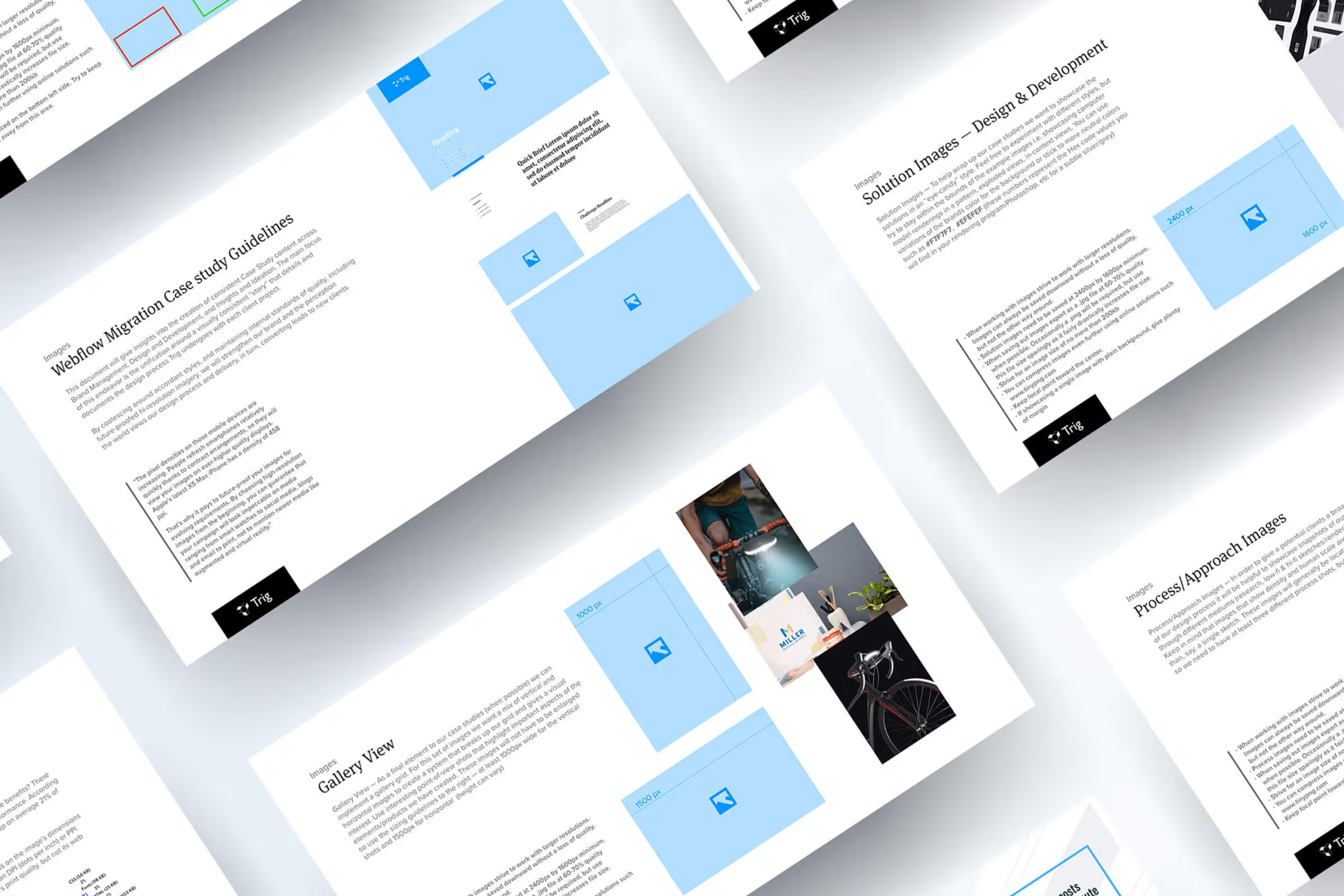
As the refined vision emerged, we created a Website Style Guide that could be used as a reference for team members who would be contributing content. A critical goal we identified for this project was to Hold the Line on design standards and consistency - with a focus on future-proofing content. As screen resolutions and internet speeds continue to improve, we wanted to find the right balance in serving up dazzling imagery that looks great on all devices without compromising performance. The style guide highlights how best to use a consistent tone in describing our work through copy as well as best practices, tips, and tricks when creating digital assets.

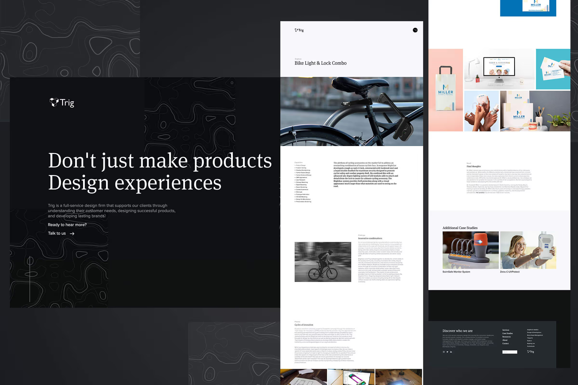
After we established a strong vision through the sitemap, XD prototypes, and style guide, we were able to confidently develop the full website. We set up the CMS structure to publish updated case studies and blog content as the first step. From there, we built template page structures following the XD prototype design intent and migrated content to its new home. Once the template pages were built, static pages were completed with the new, updated, and interactive content.
One of the things we really love about Webflow's platform is the ability to create dynamic interactions in a visual editor. As the content took shape, we were able to focus on building animations on who we are as a brand. Hover elements and page scroll animations that move content upwards and in multiple directions showcase our explorer archetype beautifully. The graceful use of micro-interactions create Easter eggs and delightful discoveries for our website visitors that are a joy to experience.

As the website development neared completion, we added integrations, ran several quality control checks, then flipped the switch on the trig.com domain from the Squarespace server to the Webflow server. We are tremendously happy with the results of the new website launch and are grateful for the contributions of colleagues and clients who supported this undertaking.


