Trig partnered with Couplet Care, Inc across two rounds of brand identity and visual design, building a unified expression for the company that spans from controlled print assets, conference materials that attract attention, to digital experiences that capture our core ethos.

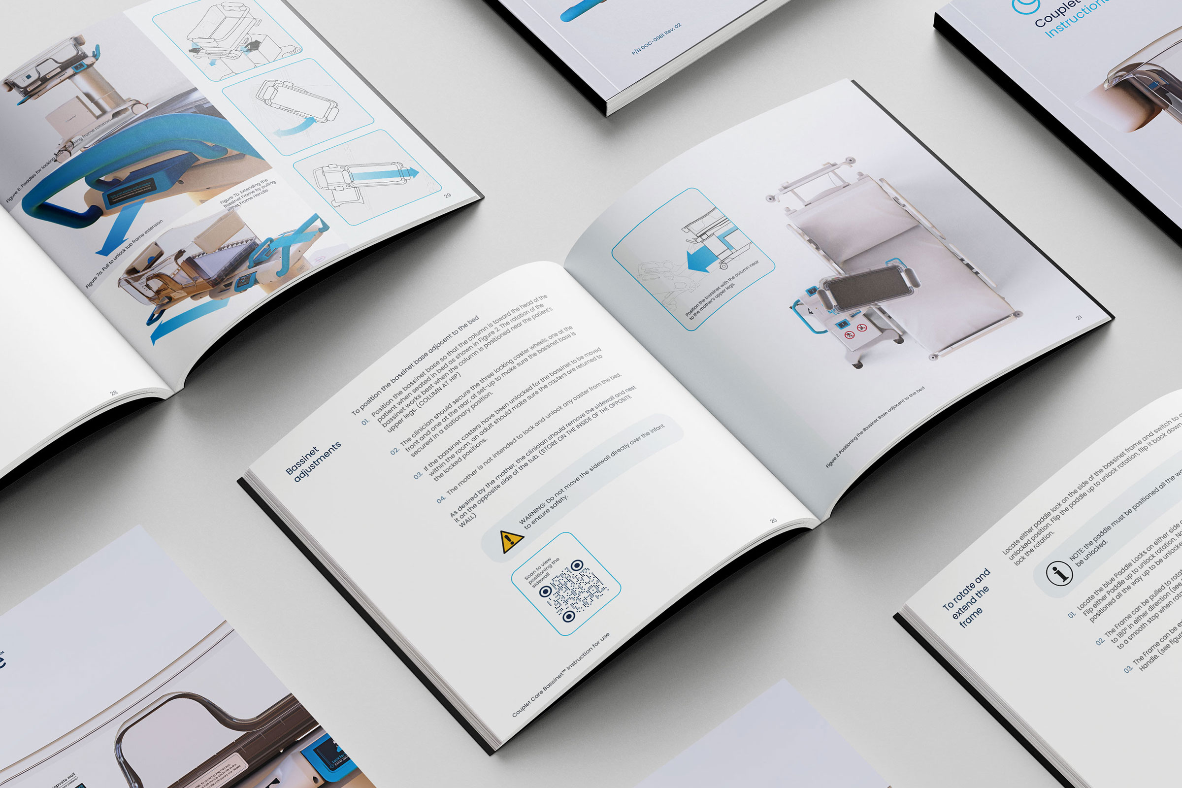
Couplet Care, Inc had developed an innovative, empathy-first bassinet ready for commercialization, but needed a professional brand presence to match the quality of its product and connect with diverse audiences—hospital decision-makers, nurses, and parents alike. The challenge was twofold: first, to create a compelling brand identity and website that would introduce Couplet Care, Inc to the world; and second, to design compliant, on-brand visual assets for a regulated medical device company—from controlled IFU labels to event booths—while maintaining consistency across every touchpoint.
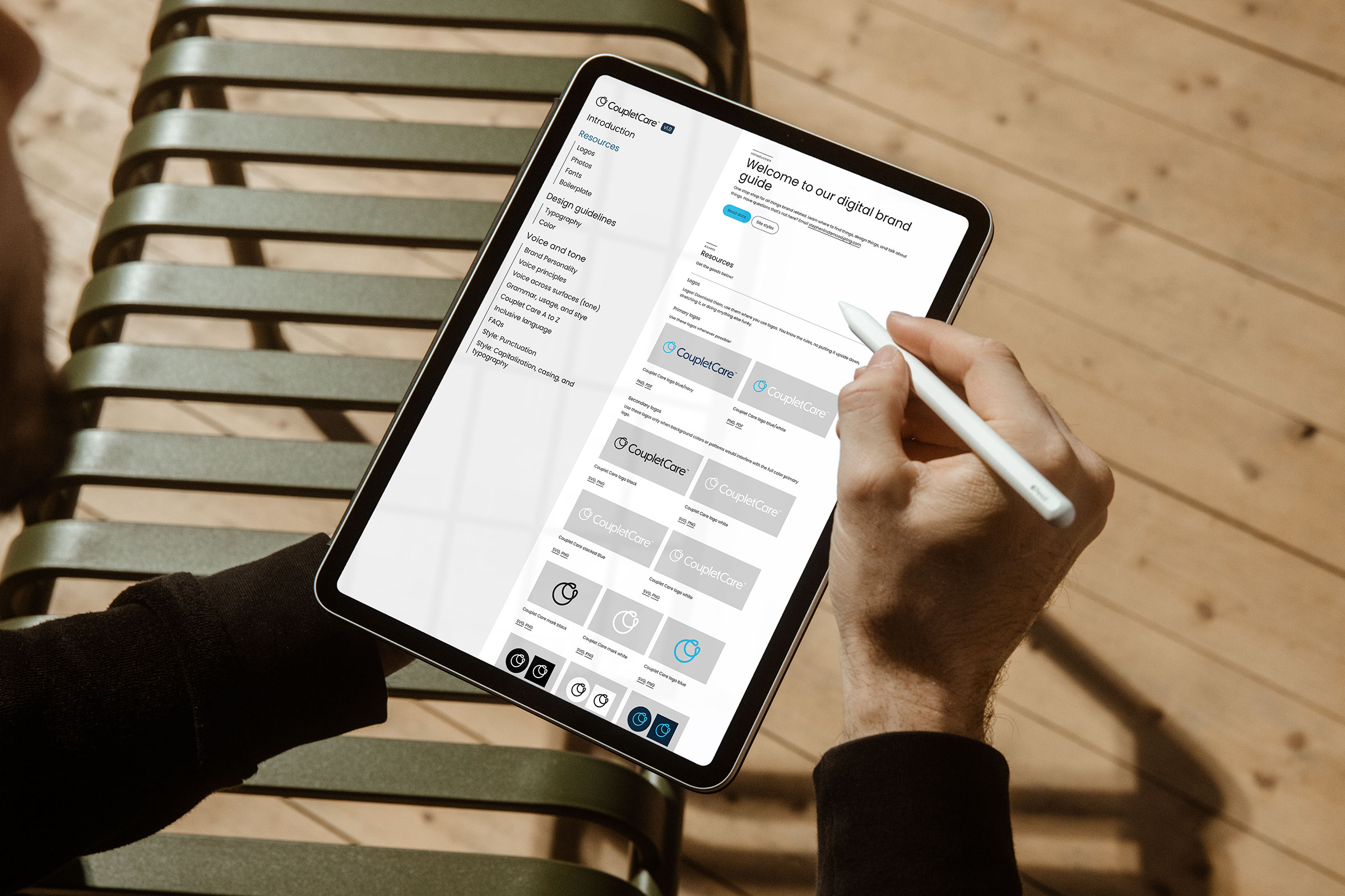
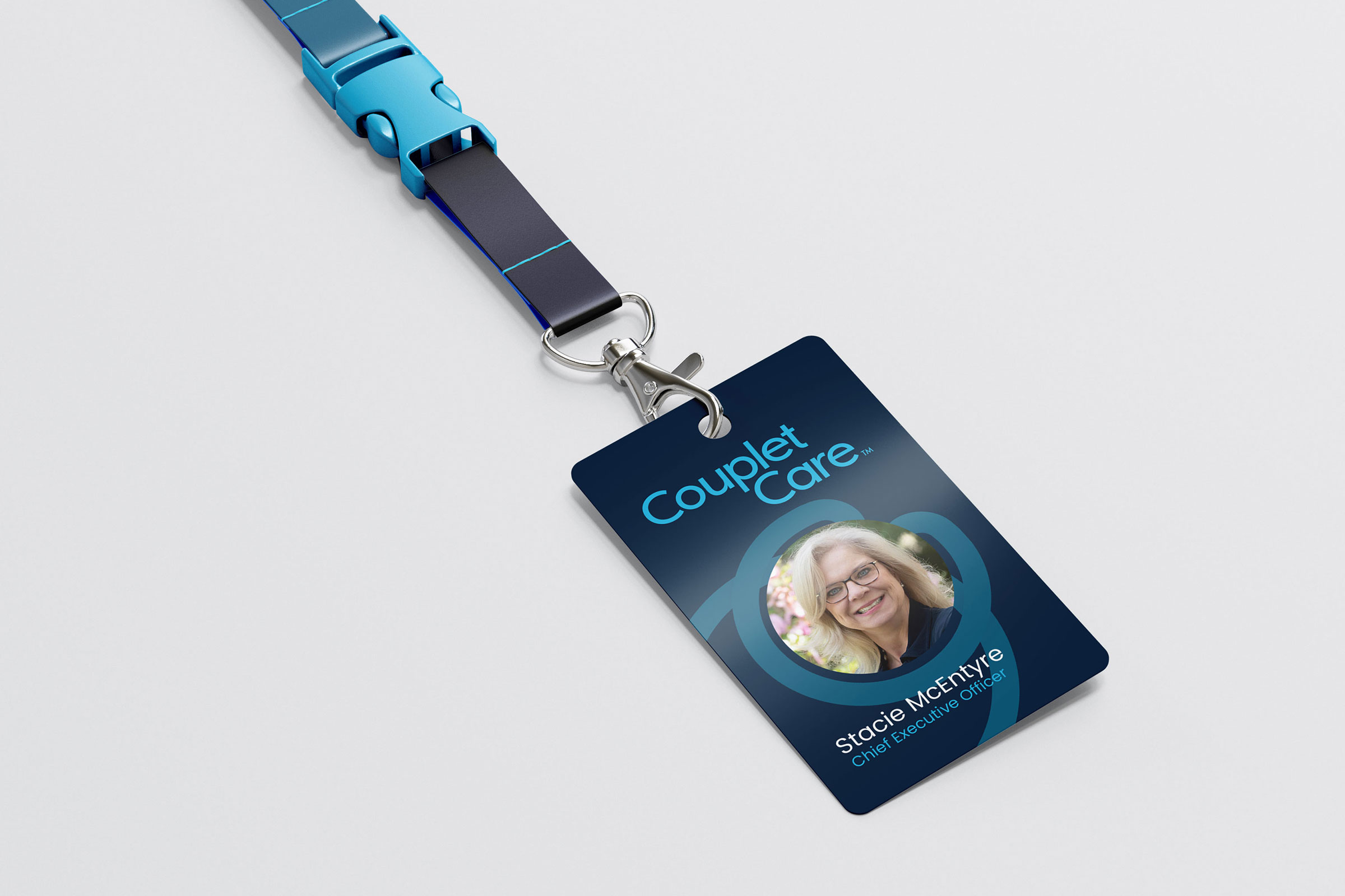
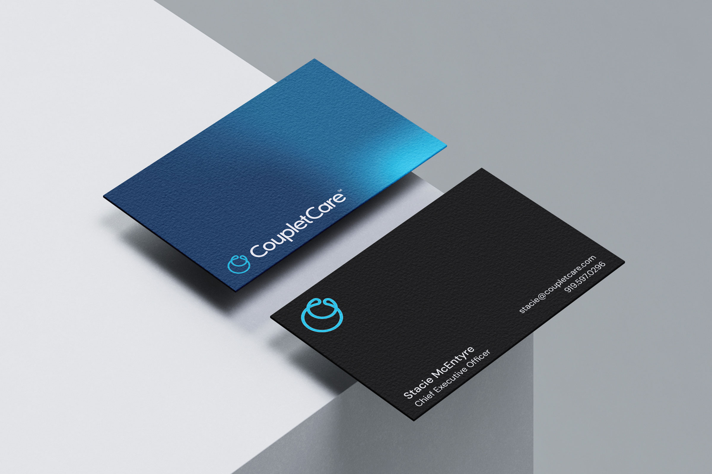
Over two rounds of development, we built the brand from the ground up and guided its evolution as the company scaled. In the first phase, we established the brand foundations—creating a logo, color palette, and typography that embodied empathy, safety, and innovation. We launched the inaugural website on an intuitive, easily managed platform to share the product vision and early research while allowing room for growth. Complementary printed materials supported investor pitches, conferences, and customer education efforts.
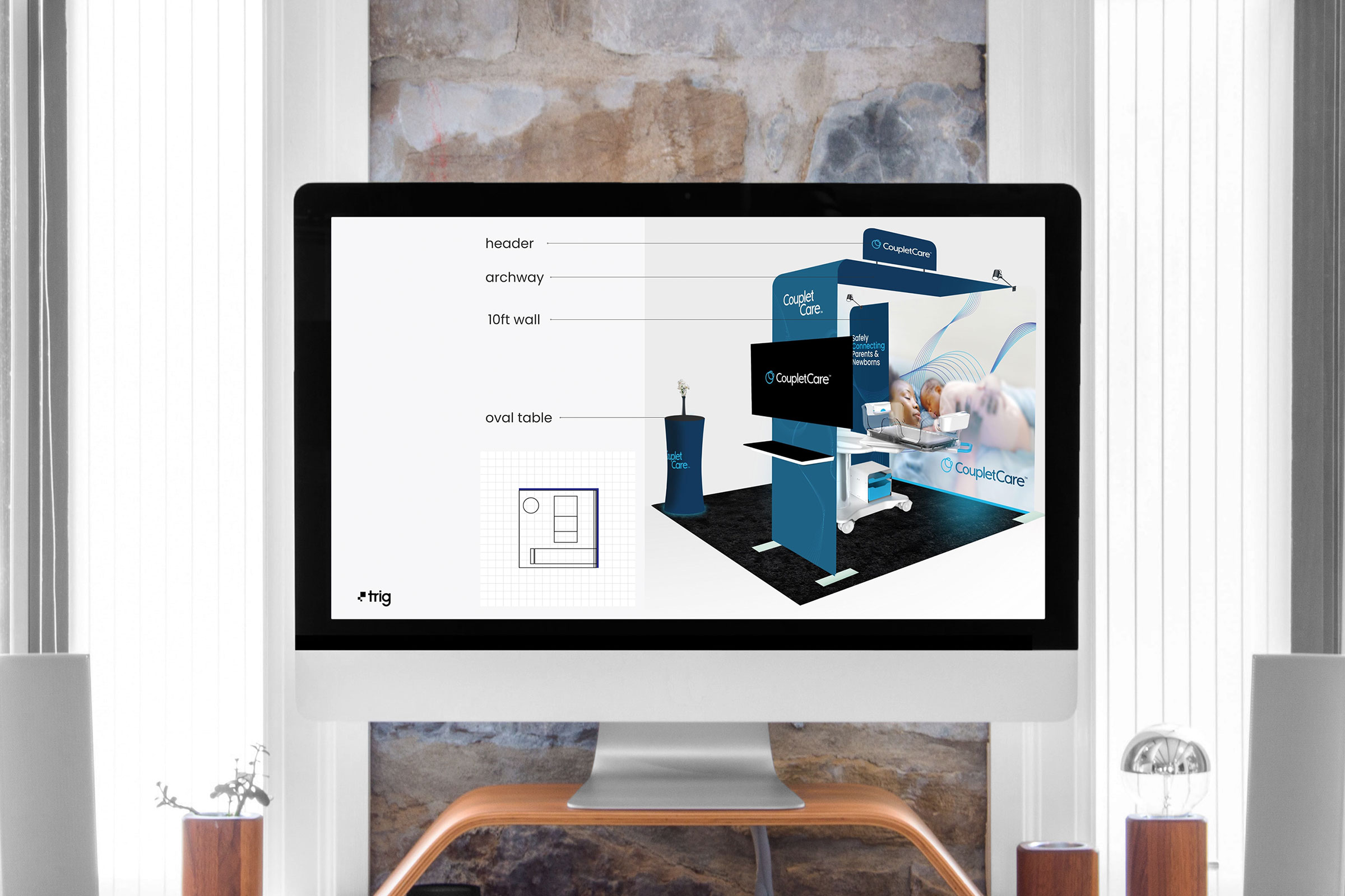
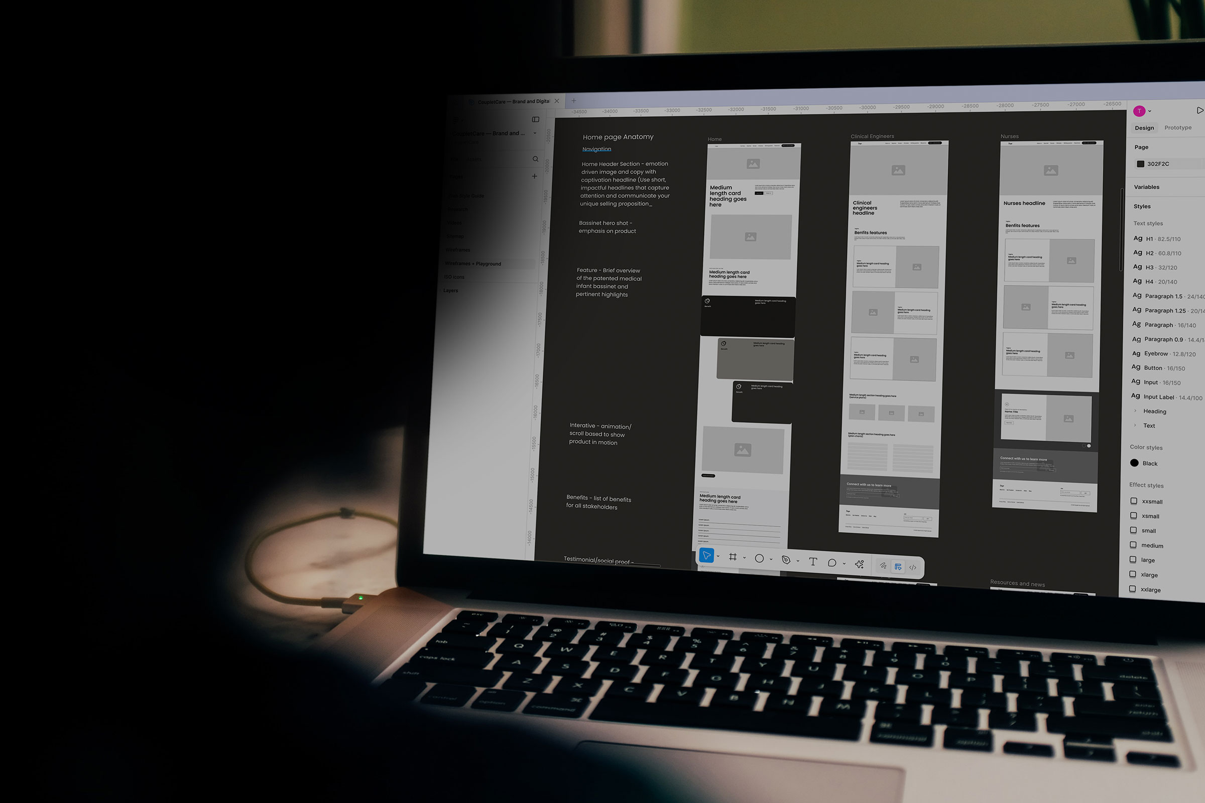
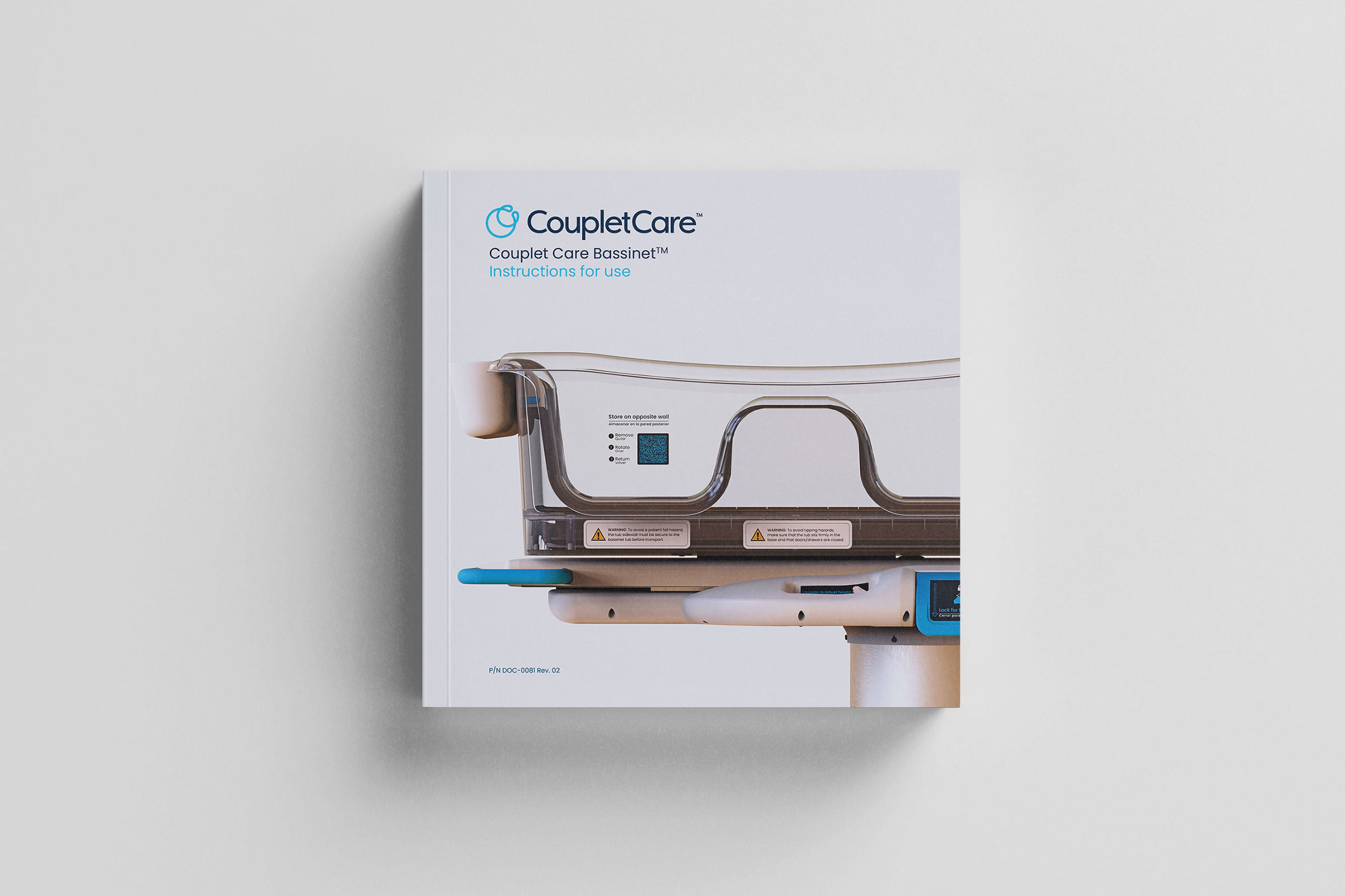
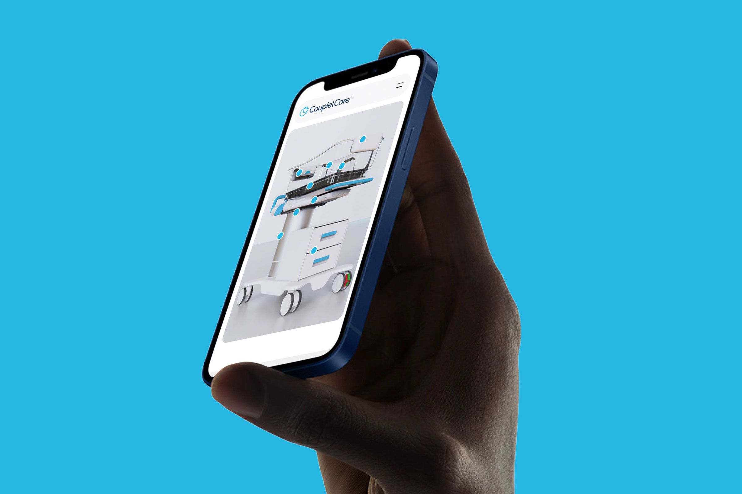
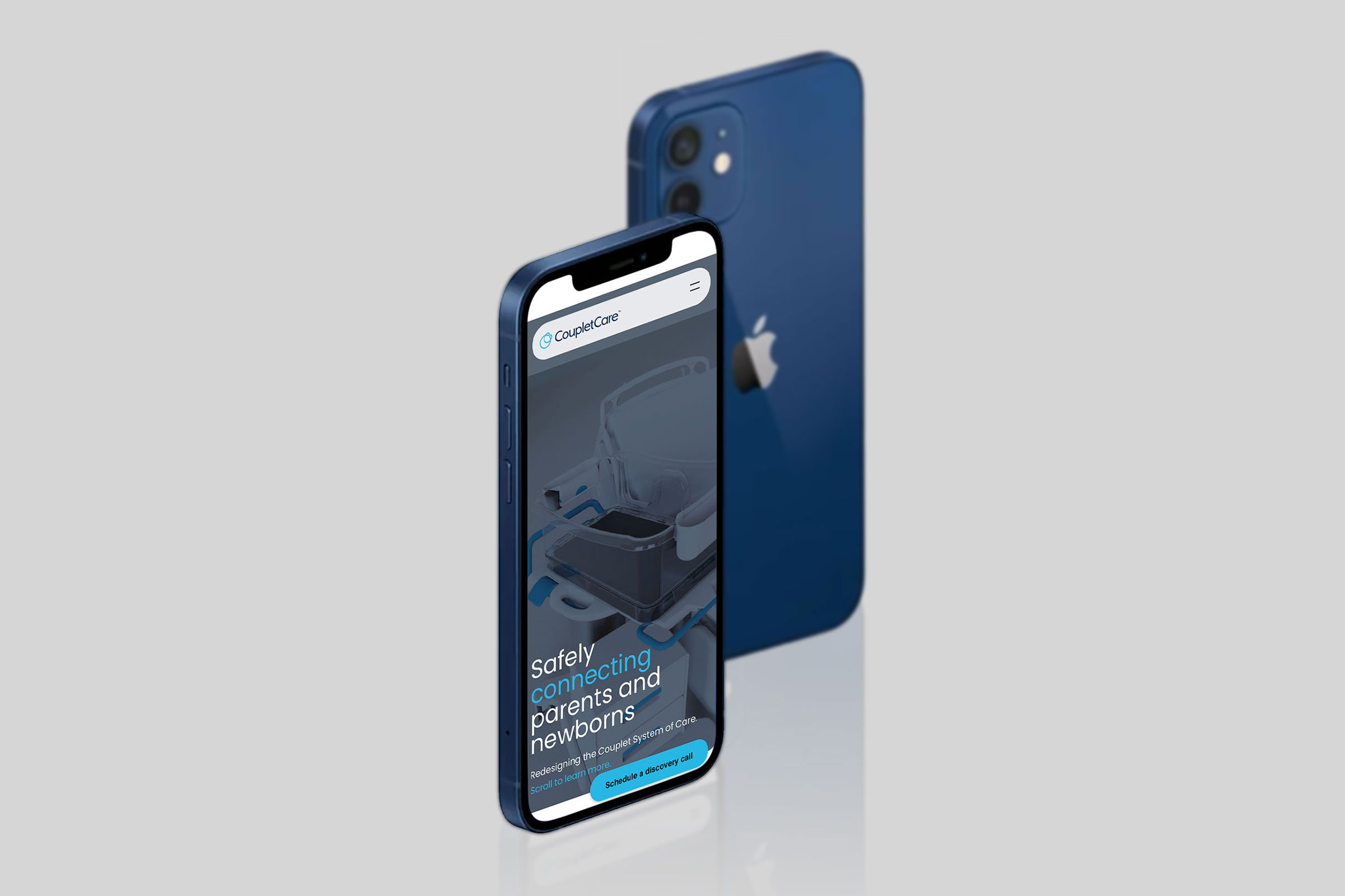
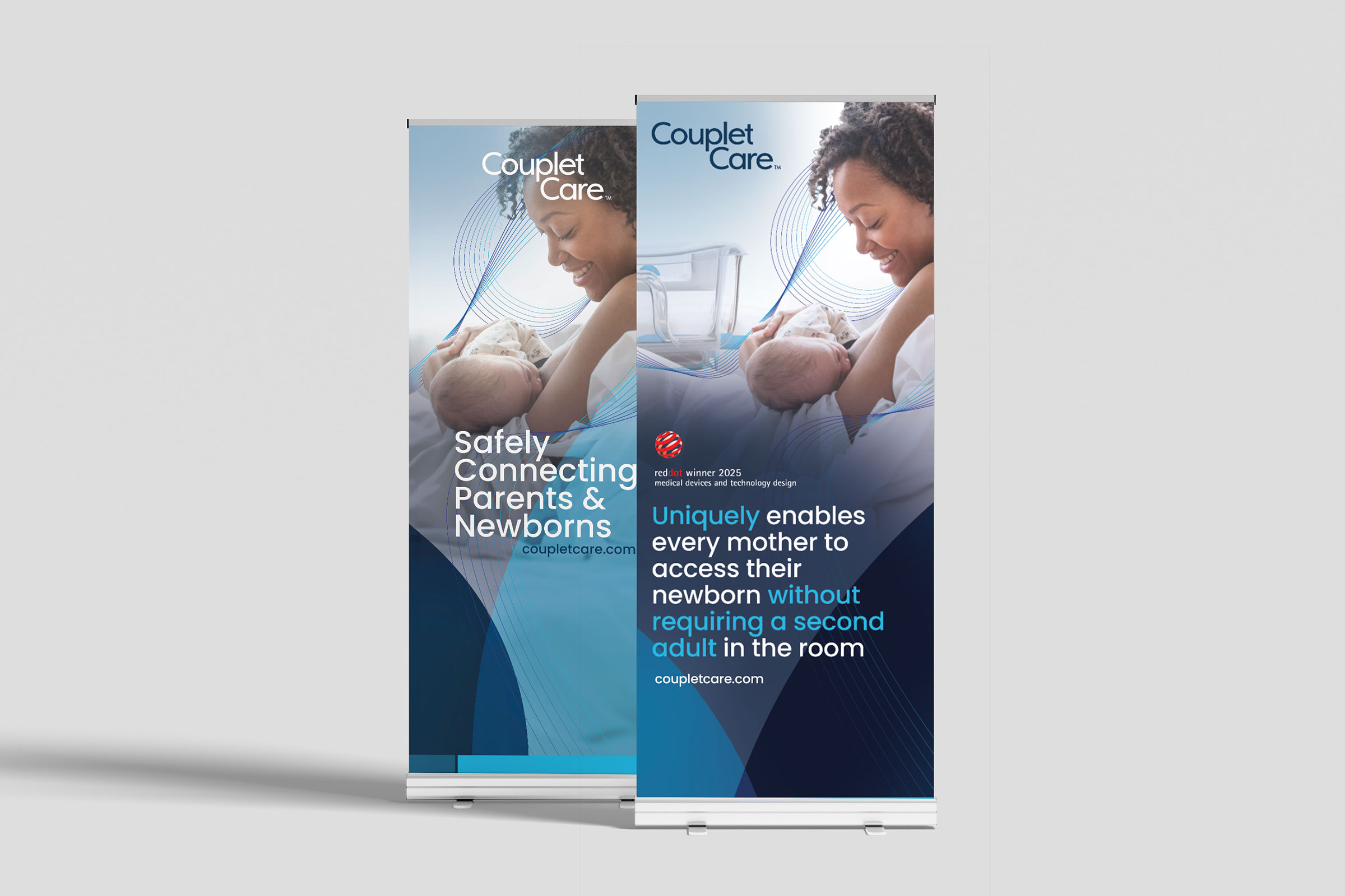
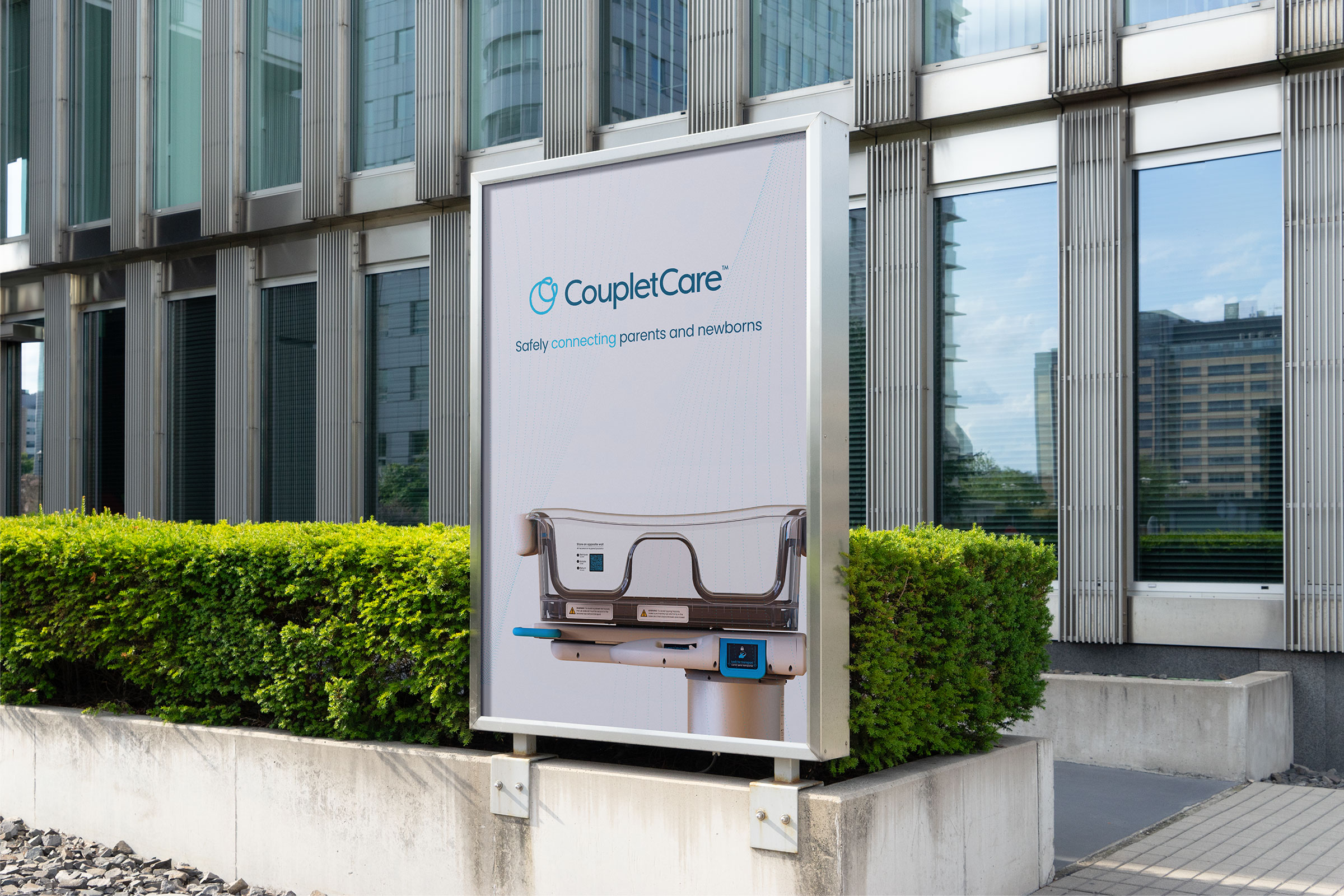
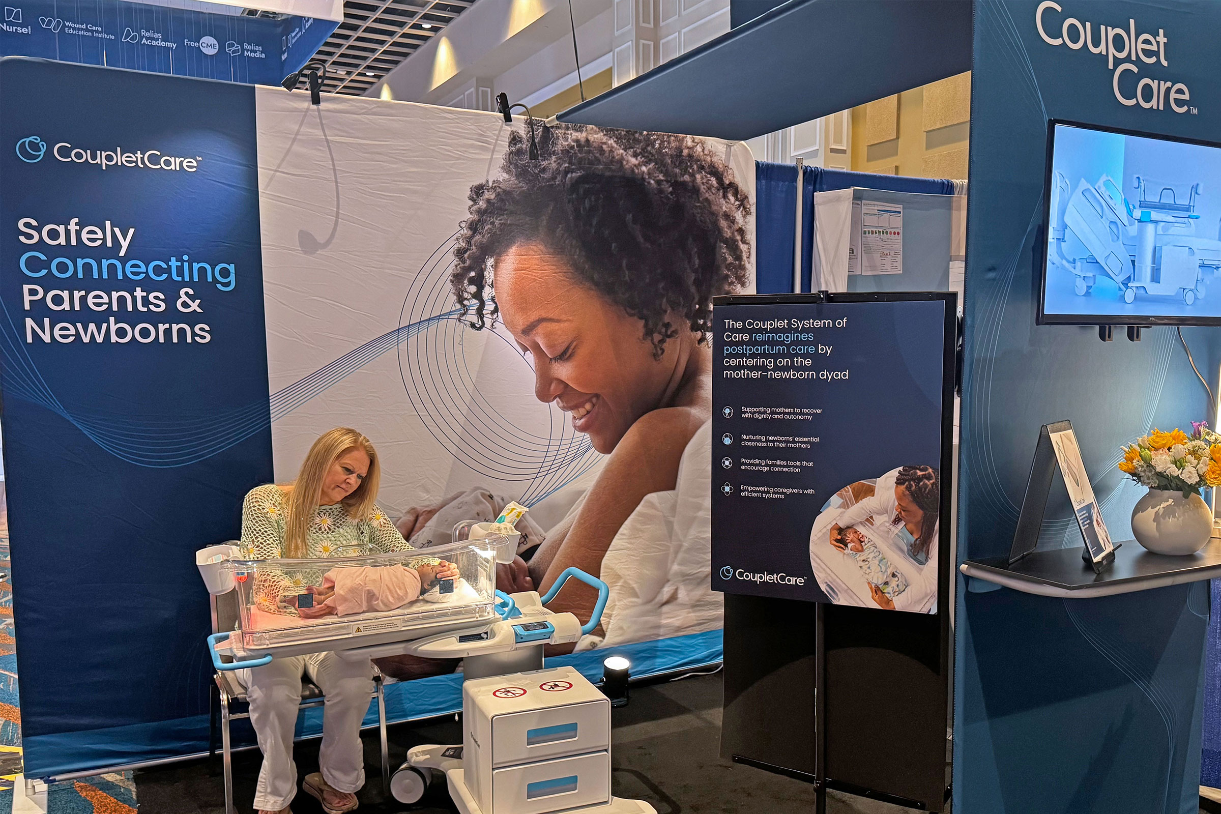
As the brand matured, we refined and expanded its identity to align with a clearer value proposition. The updated website, tailored for hospital buyers, nurse leaders, and the press, became the new digital home We also designed regulatory-compliant device labels and user materials that balanced clarity with brand integrity, and developed tradeshow environments and collateral for key industry events. To ensure long-term consistency, we implemented a Brand Asset Management system unifying internal, regulatory, and marketing touchpoints. Throughout, close collaboration with leadership ensured that every message, image, and design decision stayed true to the empathy-first vision.


Trig not only designed our product, they designed the way the world sees us. From our labels to our booth, every visual expression of Couplet Care, Inc communicates safety, dignity, and innovation. As promised, they make us shine - and I love it!

The result is a cohesive and scalable brand identity that has powered growth and recognition. It has helped secure multiple international design awards, supported a successful U.S. product launch, and positioned the company as a trusted partner to hospitals, clinicians, and investors. This unified visual foundation also sets the stage for the broader vision—the development of a comprehensive “Couplet System of Care.”
Trig partnered with Couplet Care, Inc across two rounds of brand identity and visual design, building a unified expression for the company that spans from controlled print assets, conference materials that attract attention, to digital experiences that capture our core ethos.
Couplet Care, Inc had developed an innovative, empathy-first bassinet ready for commercialization, but needed a professional brand presence to match the quality of its product and connect with diverse audiences—hospital decision-makers, nurses, and parents alike. The challenge was twofold: first, to create a compelling brand identity and website that would introduce Couplet Care, Inc to the world; and second, to design compliant, on-brand visual assets for a regulated medical device company—from controlled IFU labels to event booths—while maintaining consistency across every touchpoint.
Over two rounds of development, we built the brand from the ground up and guided its evolution as the company scaled. In the first phase, we established the brand foundations—creating a logo, color palette, and typography that embodied empathy, safety, and innovation. We launched the inaugural website on an intuitive, easily managed platform to share the product vision and early research while allowing room for growth. Complementary printed materials supported investor pitches, conferences, and customer education efforts.
As the brand matured, we refined and expanded its identity to align with a clearer value proposition. The updated website, tailored for hospital buyers, nurse leaders, and the press, became the new digital home We also designed regulatory-compliant device labels and user materials that balanced clarity with brand integrity, and developed tradeshow environments and collateral for key industry events. To ensure long-term consistency, we implemented a Brand Asset Management system unifying internal, regulatory, and marketing touchpoints. Throughout, close collaboration with leadership ensured that every message, image, and design decision stayed true to the empathy-first vision.

Couplet Care, Inc now has a cohesive visual system that expresses empathy and professionalism across every touchpoint. The brand bridges the worlds of medical regulation and patient-centered storytelling, creating a language that feels both credible and deeply human. Designed to serve hospital buyers and nurses alike, the system delivers clear, consistent, and trustworthy information while elevating the Couplet Care Bassinet as a globally recognized, award-winning innovation.


Trig not only designed our product, they designed the way the world sees us. From our labels to our booth, every visual expression of Couplet Care, Inc communicates safety, dignity, and innovation. As promised, they make us shine - and I love it!
The result is a cohesive and scalable brand identity that has powered growth and recognition. It has helped secure multiple international design awards, supported a successful U.S. product launch, and positioned the company as a trusted partner to hospitals, clinicians, and investors. This unified visual foundation also sets the stage for the broader vision—the development of a comprehensive “Couplet System of Care.”
Trig partnered with Couplet Care, Inc across two rounds of brand identity and visual design, building a unified expression for the company that spans from controlled print assets, conference materials that attract attention, to digital experiences that capture our core ethos.
Couplet Care, Inc had developed an innovative, empathy-first bassinet ready for commercialization, but needed a professional brand presence to match the quality of its product and connect with diverse audiences—hospital decision-makers, nurses, and parents alike. The challenge was twofold: first, to create a compelling brand identity and website that would introduce Couplet Care, Inc to the world; and second, to design compliant, on-brand visual assets for a regulated medical device company—from controlled IFU labels to event booths—while maintaining consistency across every touchpoint.
Over two rounds of development, we built the brand from the ground up and guided its evolution as the company scaled. In the first phase, we established the brand foundations—creating a logo, color palette, and typography that embodied empathy, safety, and innovation. We launched the inaugural website on an intuitive, easily managed platform to share the product vision and early research while allowing room for growth. Complementary printed materials supported investor pitches, conferences, and customer education efforts.
As the brand matured, we refined and expanded its identity to align with a clearer value proposition. The updated website, tailored for hospital buyers, nurse leaders, and the press, became the new digital home We also designed regulatory-compliant device labels and user materials that balanced clarity with brand integrity, and developed tradeshow environments and collateral for key industry events. To ensure long-term consistency, we implemented a Brand Asset Management system unifying internal, regulatory, and marketing touchpoints. Throughout, close collaboration with leadership ensured that every message, image, and design decision stayed true to the empathy-first vision.
Couplet Care, Inc now has a cohesive visual system that expresses empathy and professionalism across every touchpoint. The brand bridges the worlds of medical regulation and patient-centered storytelling, creating a language that feels both credible and deeply human. Designed to serve hospital buyers and nurses alike, the system delivers clear, consistent, and trustworthy information while elevating the Couplet Care Bassinet as a globally recognized, award-winning innovation.
Trig not only designed our product, they designed the way the world sees us. From our labels to our booth, every visual expression of Couplet Care, Inc communicates safety, dignity, and innovation. As promised, they make us shine - and I love it!
The result is a cohesive and scalable brand identity that has powered growth and recognition. It has helped secure multiple international design awards, supported a successful U.S. product launch, and positioned the company as a trusted partner to hospitals, clinicians, and investors. This unified visual foundation also sets the stage for the broader vision—the development of a comprehensive “Couplet System of Care.”